ABSTRACTION
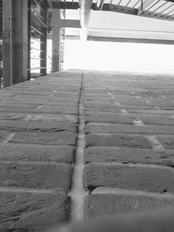
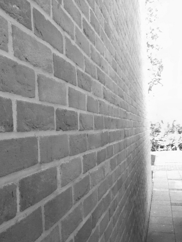
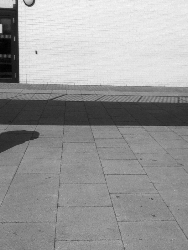
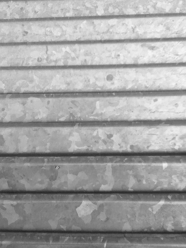
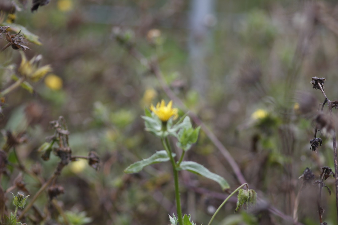
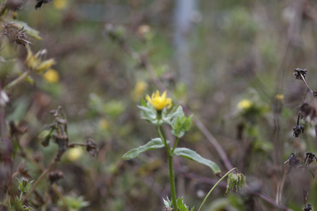
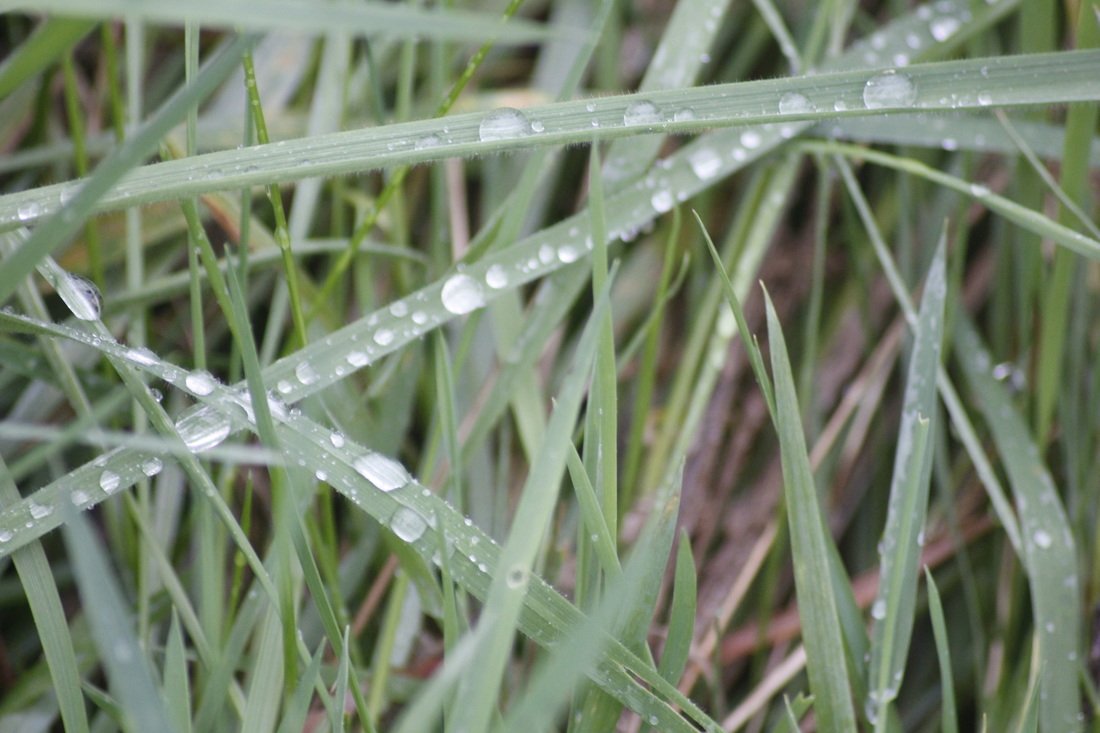
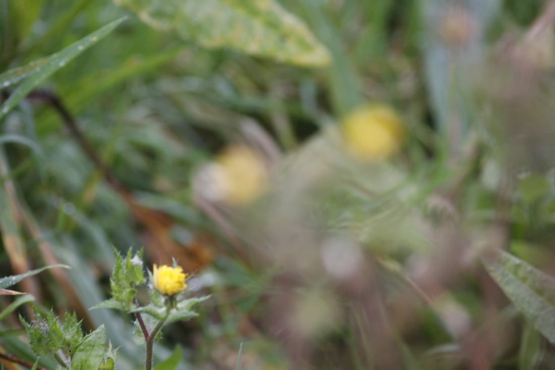
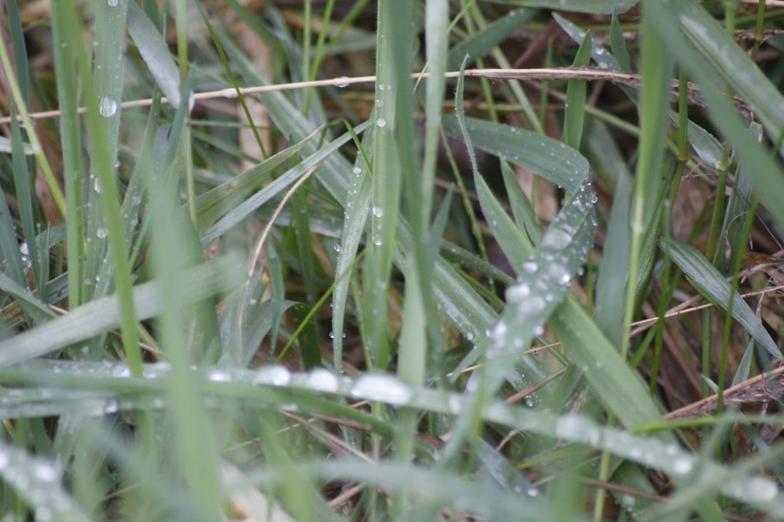
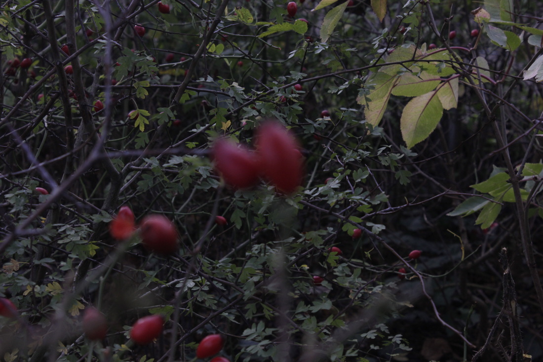
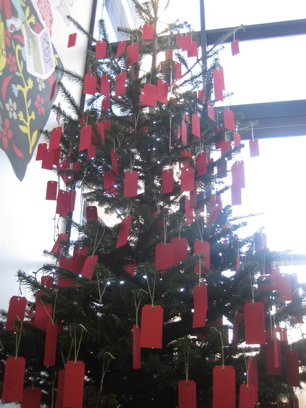
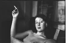
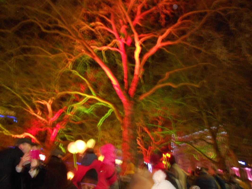
Abstract photos: In school set one
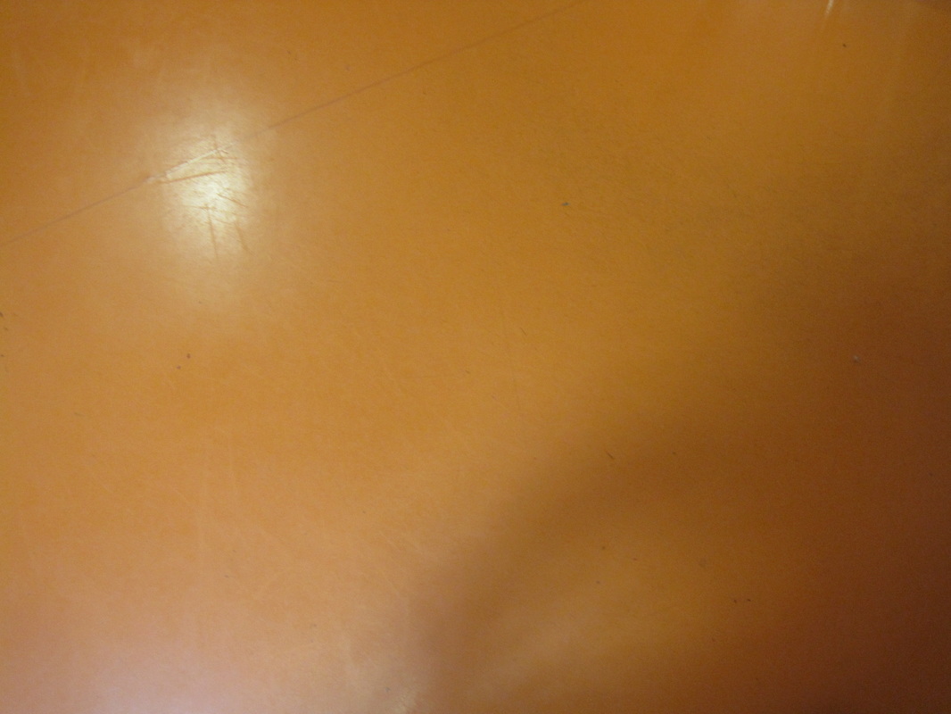
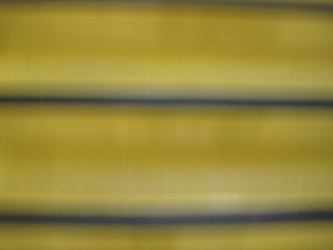
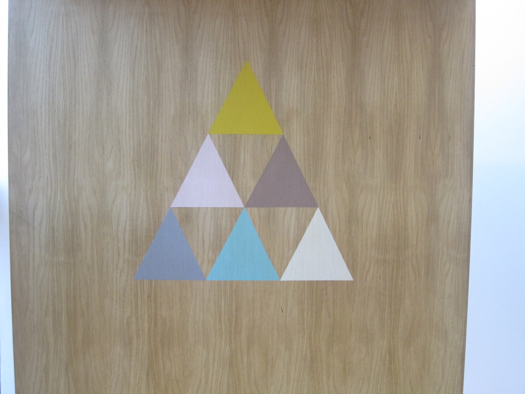
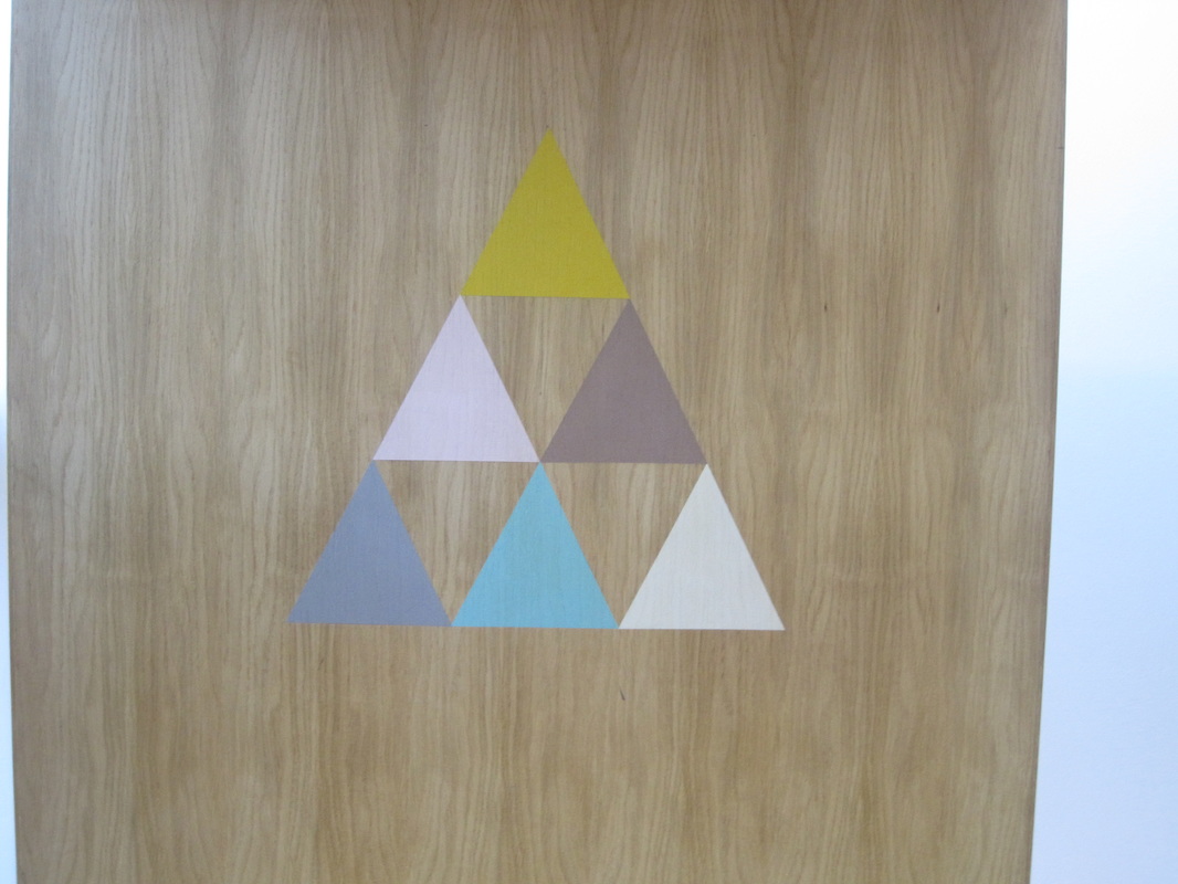
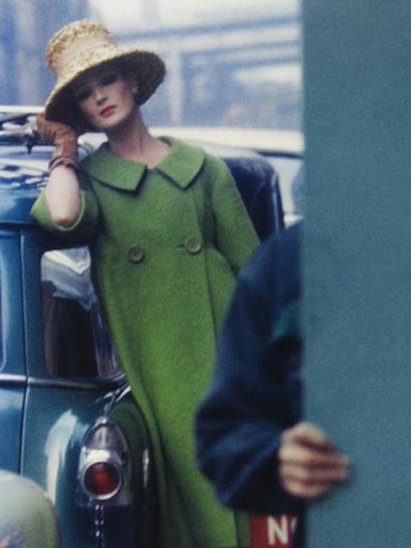
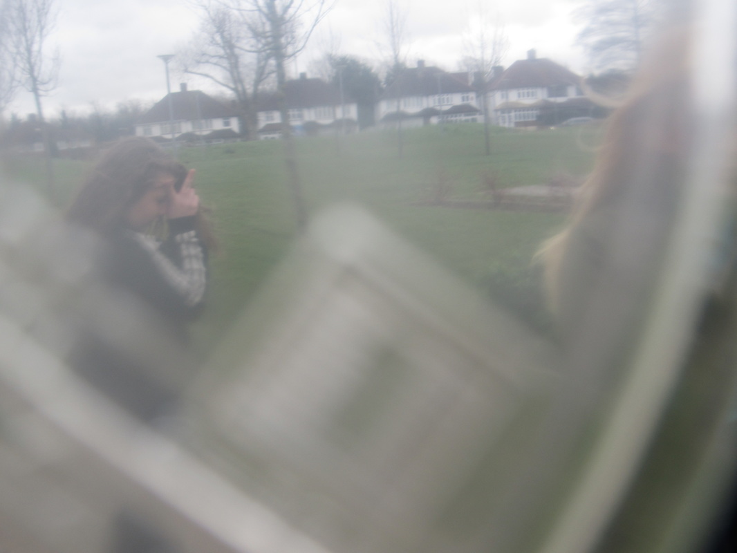
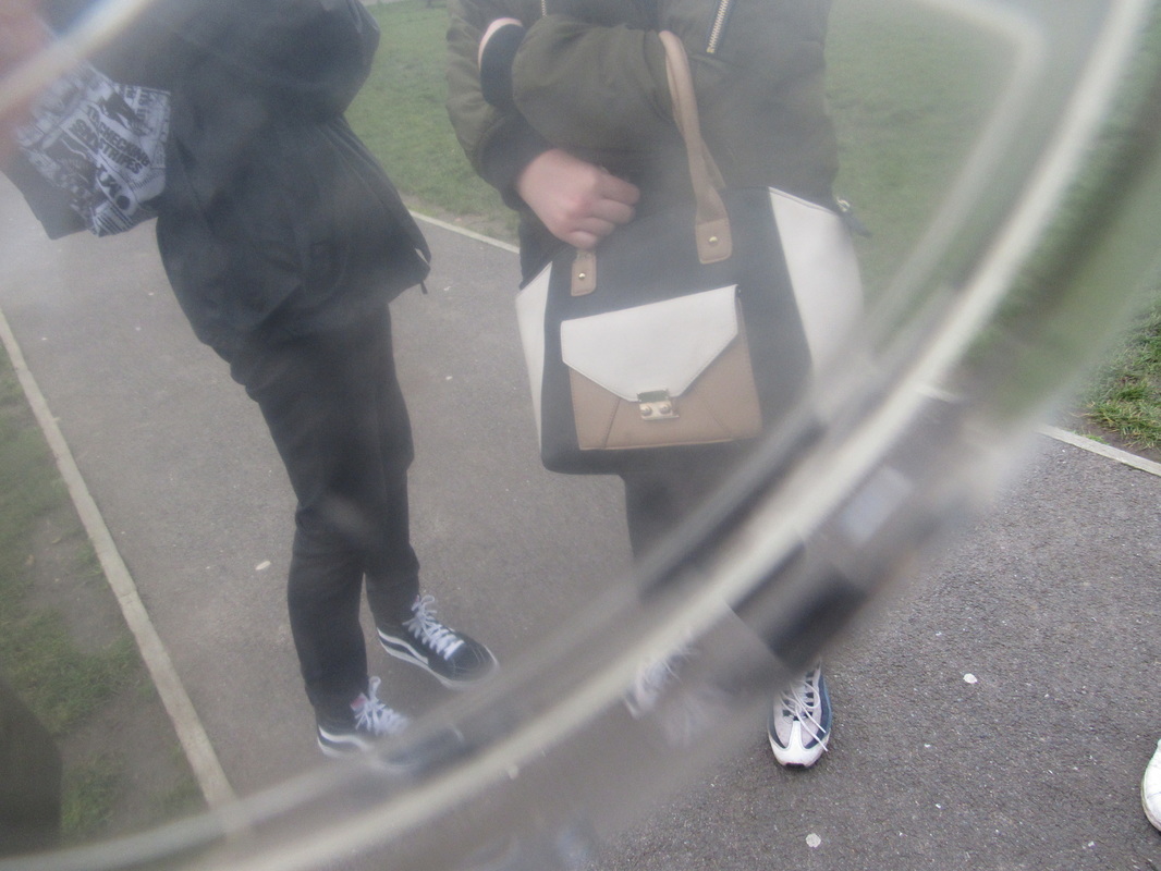
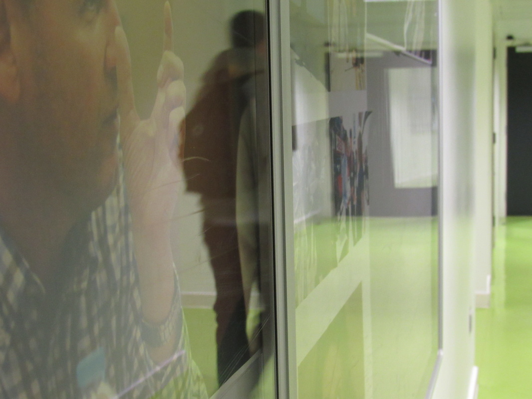
Abstract Photos: Home set 1Abstract Photos: Set two school |
|


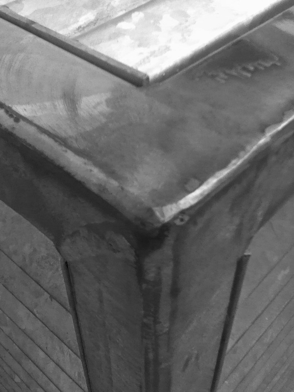

The Formal Elements.
Photographers are usually aware of the ways in which they can create interest in their images beyond the simple fact of the subject. This is what separates good pictures and bad pictures of the same thing. The following list describes some of the abstract elements in any photograph. Below the list is an example of how you can analyse a photograph looking for these things specifically and how this helps to give the image meaning:
Focus: How much of the image is clearly visible or blurred
Light: the lighting in the picture
Line: visible lines on the images, which can be made using a straight edge
Repetition: repeating motifs in the image
Shape: the shapes enraptured in the image
Space: the use of spacing out the subjects of the image
Texture: visible textures in the image
Value/Tone: the contrast between light and dark colours.
Which areas appear clearest or sharpest in the photograph? Which do not?
Which areas of the photograph are brightest? Are there any shadows? Does the photograph allow you to guess the time of day? Is the light natural or artificial? Harsh or soft? Reflected or direct?
Are there objects in the photograph that act as lines? Are they straight, curvy, thin, thick? Do the lines create direction in the photograph? Do they outline? Do the lines show movement or energy?
Are there any objects, shapes or lines which repeat and create a pattern?
Do you see geometric (straight edged) or organic (curvy) shapes? Which are they?
Is there depth to the photograph or does it seem shallow? What creates this appearance? Are there important negative (empty) spaces in addition to positive (solid) spaces? Is there depth created by spatial illusions i.e. perspective?
If you could touch the surface of the photograph how would it feel? How do the objects in the picture look like they would feel?
Is there a range of tones from dark to light? Where is the darkest value? Where is the lightest?
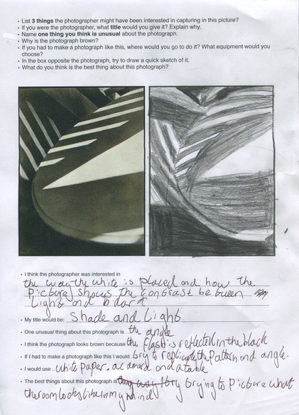
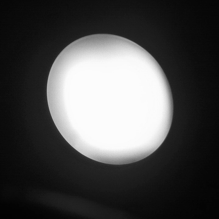
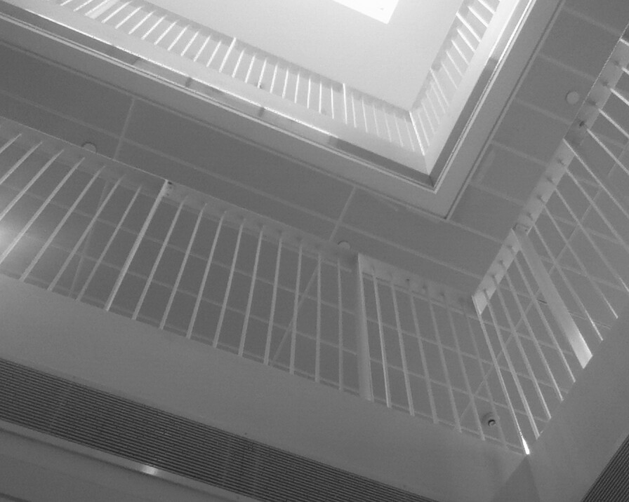
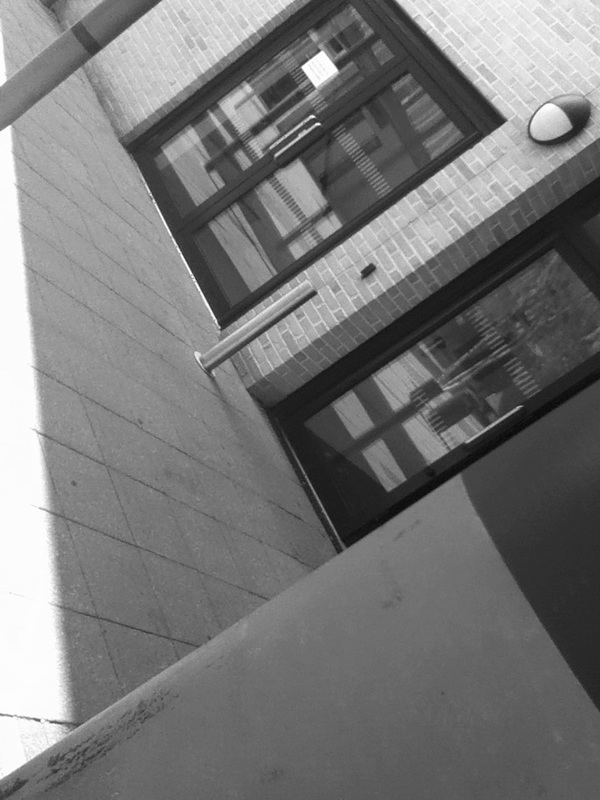
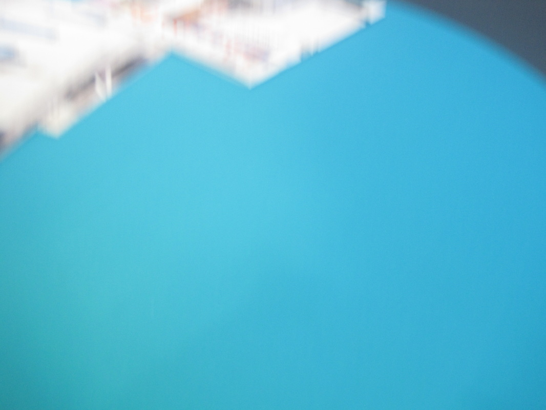
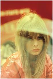
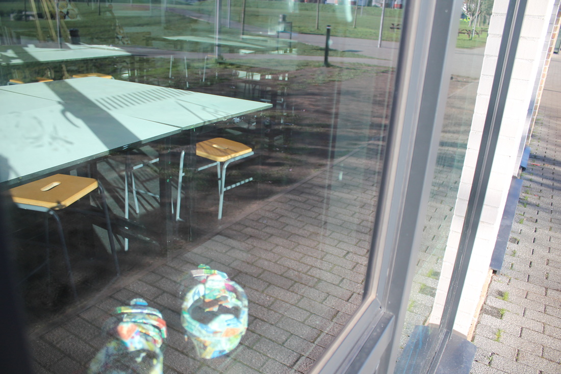
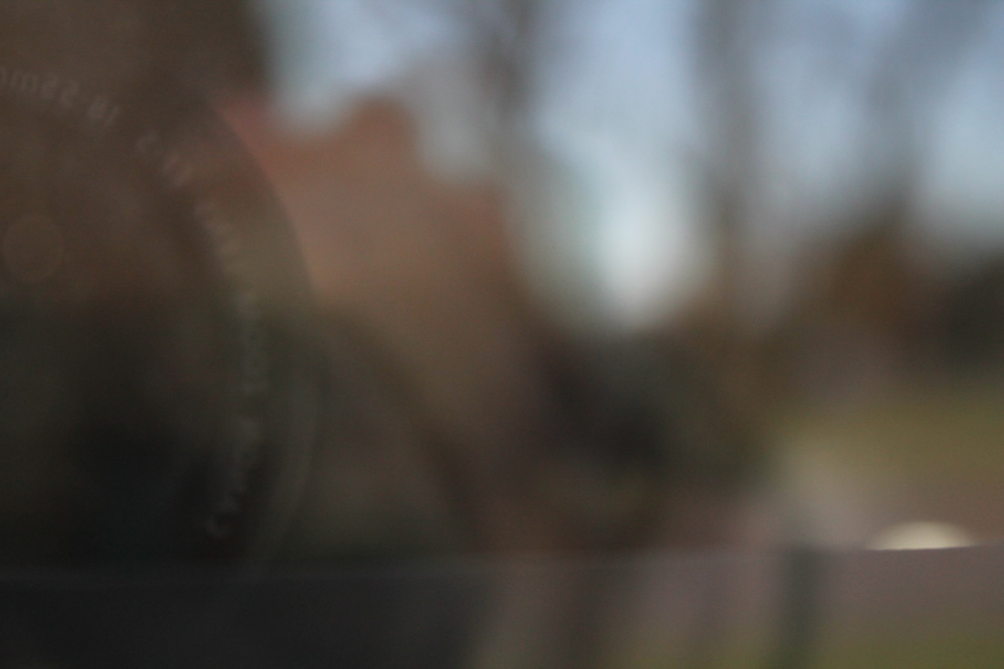
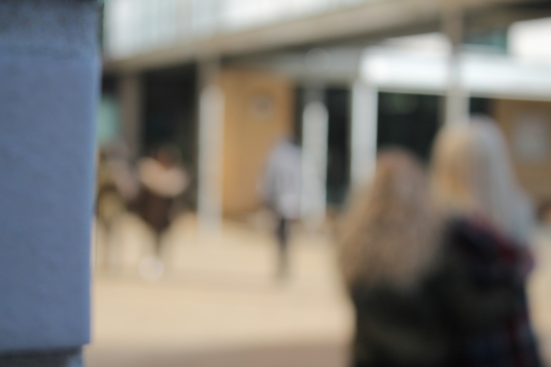
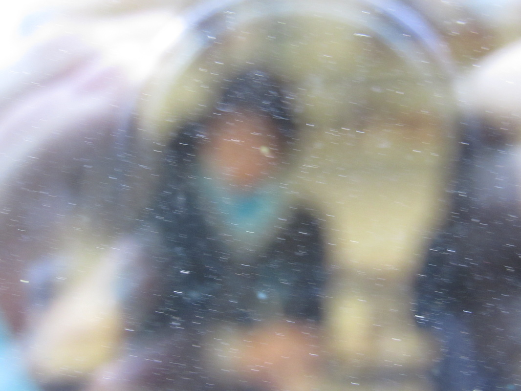
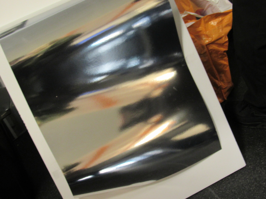
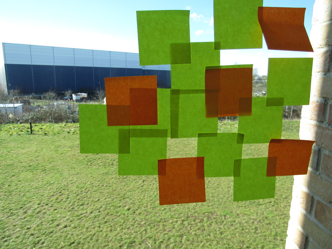
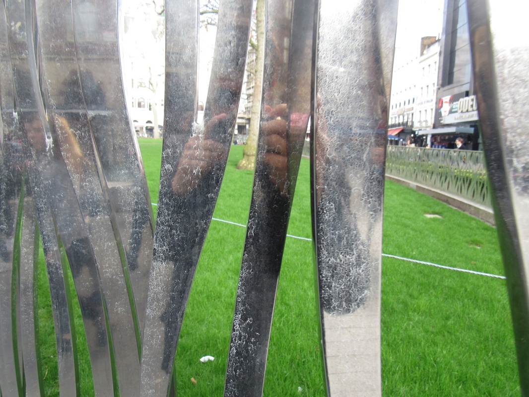
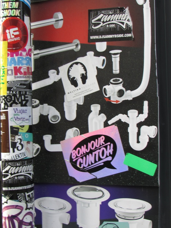
This Photograph is abstract because its plays with light, focus and repetition. It plays with light by using a light grey and white in the foreground then in the center of the picture or the "background" it uses black with blurred pieces of white, this shows that part of the picture is deliberatly out of focus. The photo plays with repetition by showing, the almost unifor, triangluar segments framing the black un-focused circle in the center
|
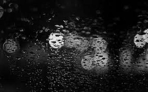
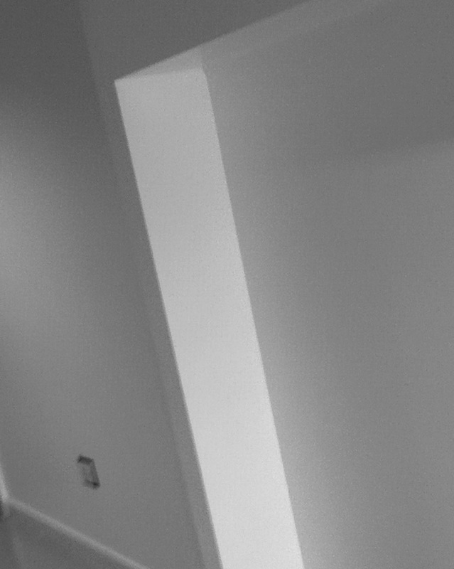
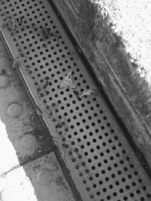
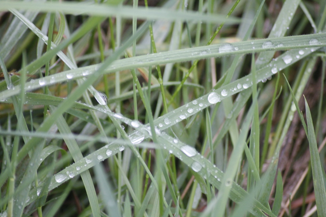
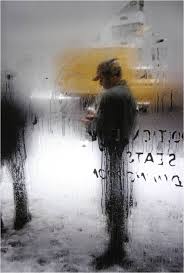
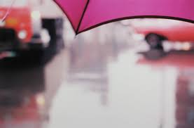
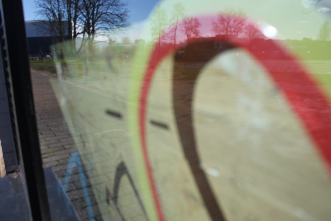
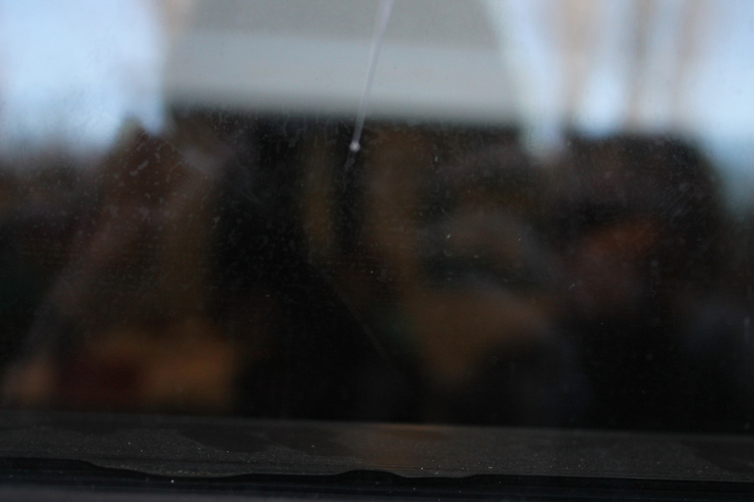
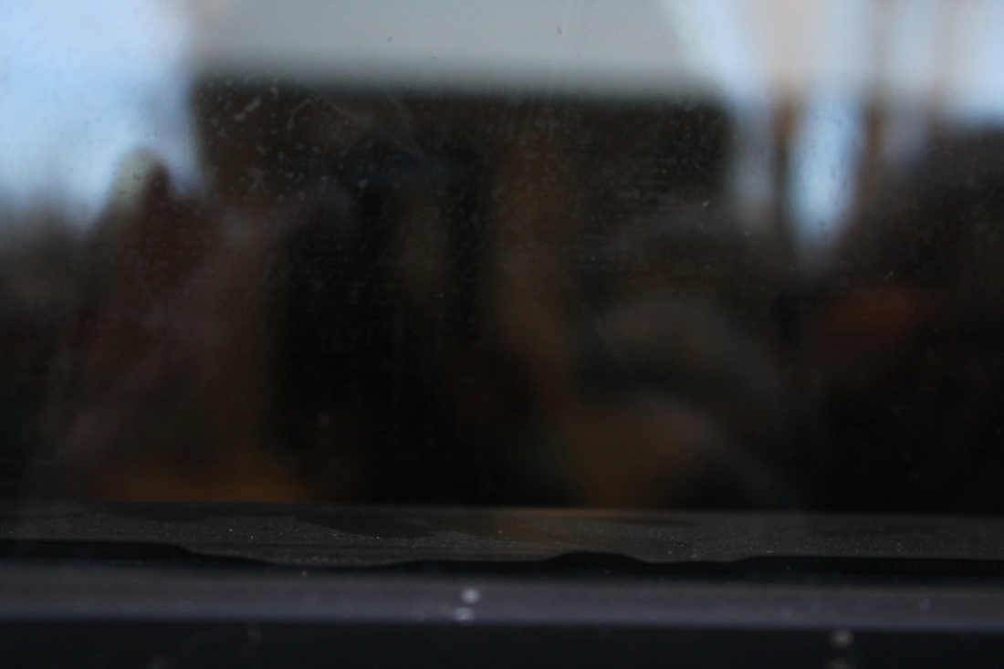
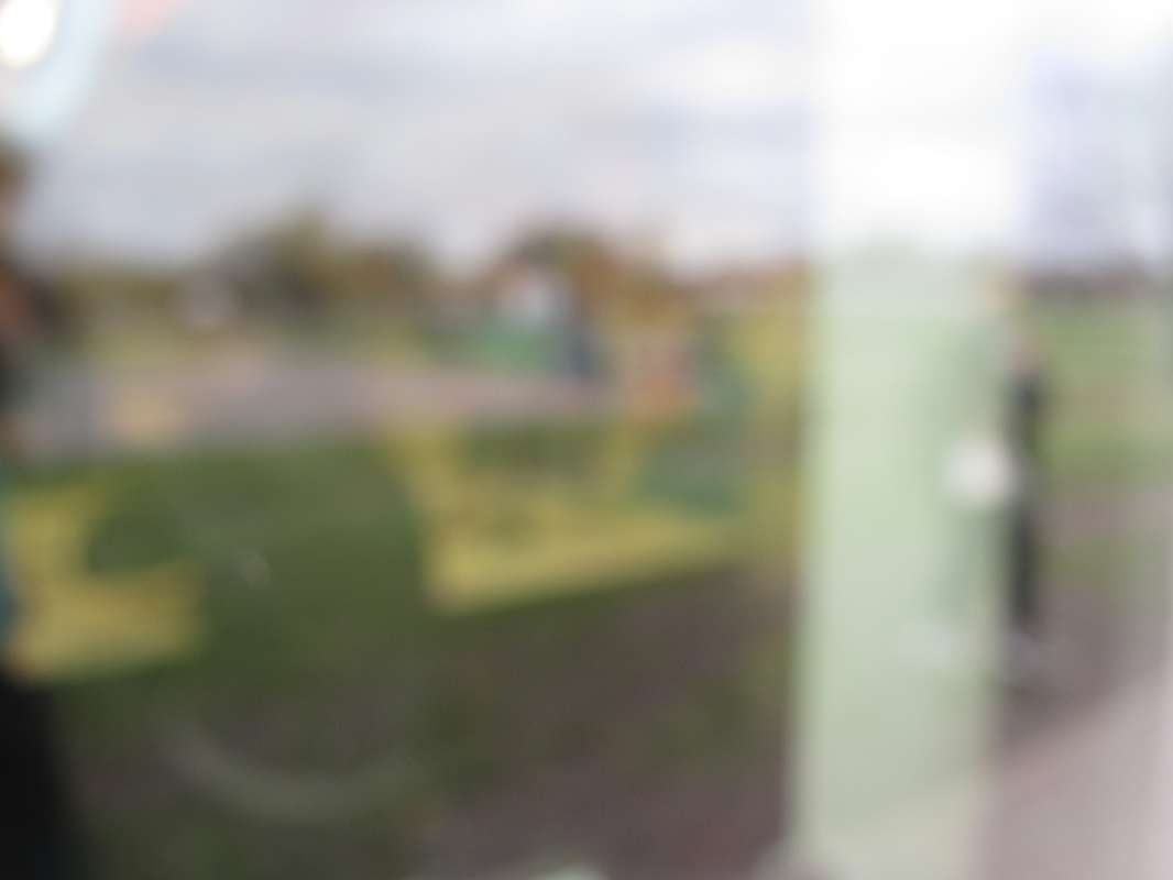
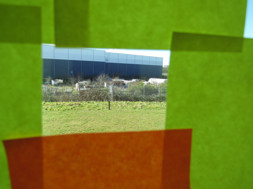
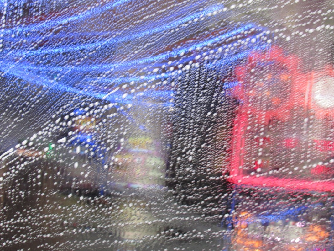
This image is abstract because of the Unfocused background, the texture of the rain on the lens and the what seem to be lights in the background, these could represent a busy street or a bright cityscape. The focus in the picture adds to the illusion, by blurring out the background it opens the posibilites as to what the photograph could actually be. The texture of the rain humanises the picture and makes it more belivable and at the same time alluring.
|
|
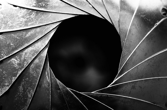
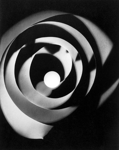
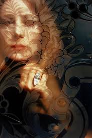
This is a photogram taken by Man Ray in 1926. This is one of my favourite photograms because i like the way it plays with repetition,light and shape. It plays with repetition by repeating the spiral pattern throughout the whole image In this image there are several monochromatic colours such as white, grey and black then all these colours are varied in tones to create a spiral. This gives the effect of congestion and that more objects have been used, than actually were used. I think the image was created by using a thick coil of some sort, then the light was shone onto the paper in bursts of a few seconds, from different angles. This creates the look of shadows and different shades of light.
|
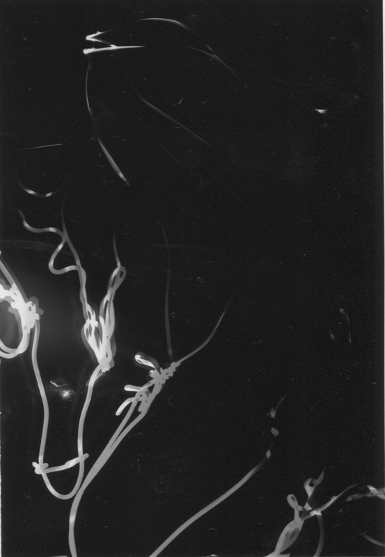

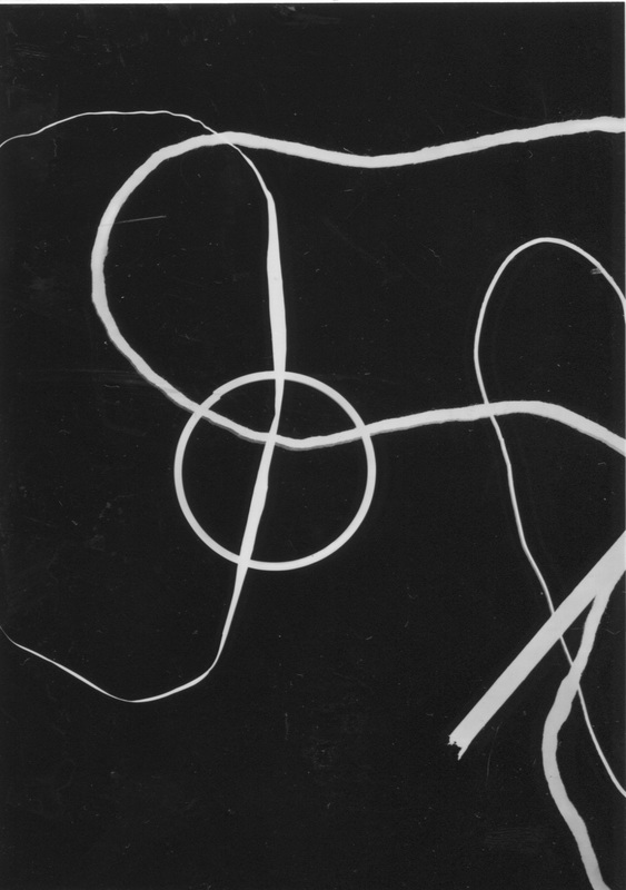

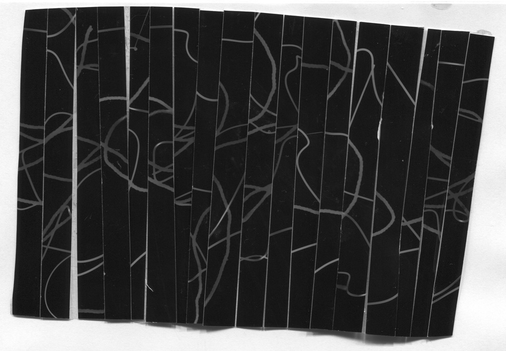
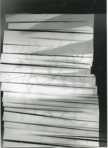
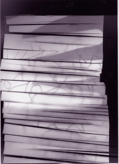
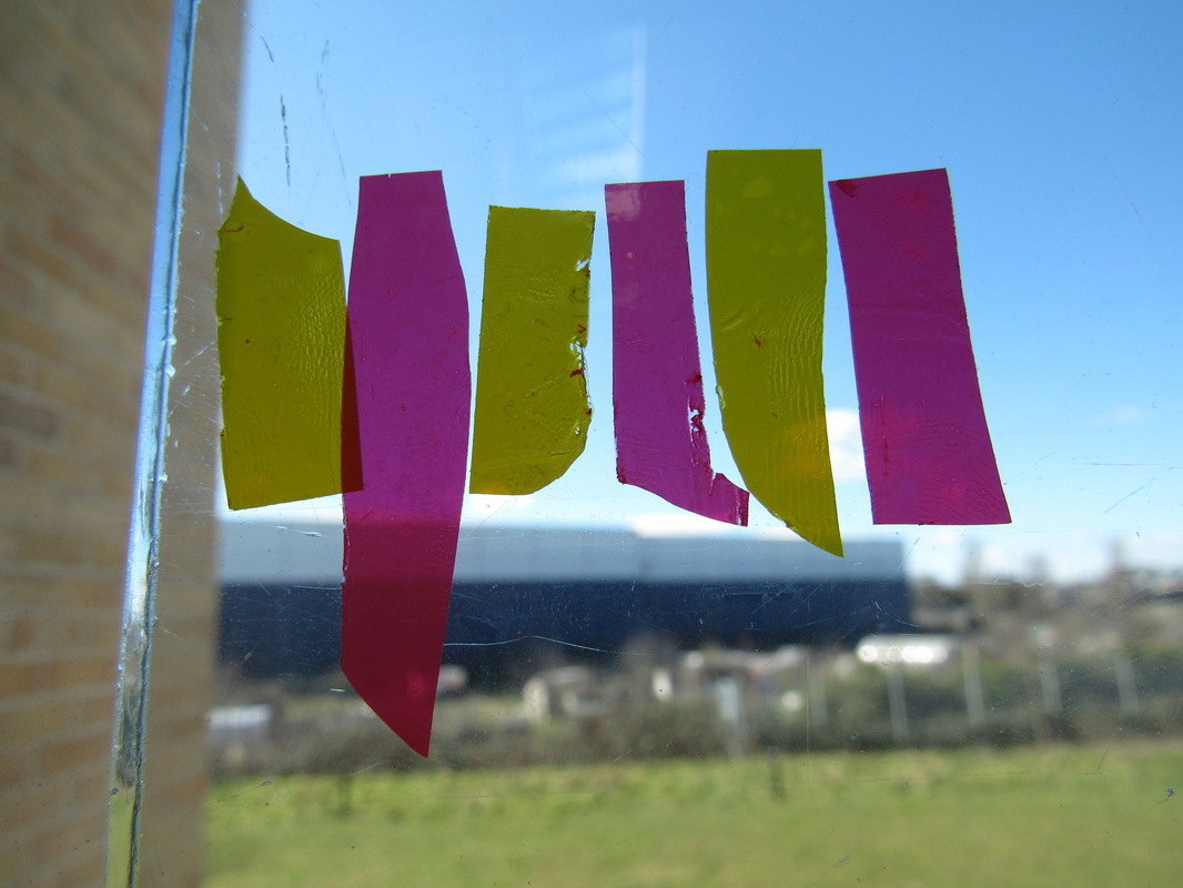
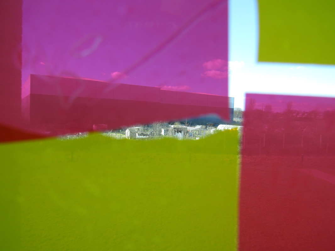
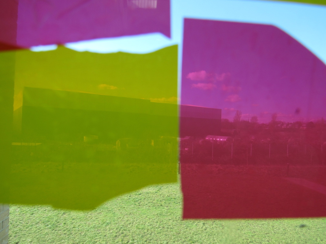
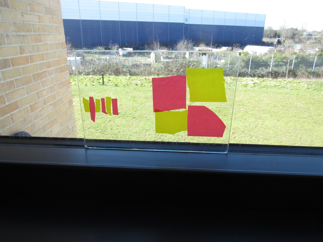
Photogram Cut upsI made this by cutting up an existing photogram and rearranging it to my taste. Then i placed the pieces onto pieces of tape to join them together. Next i went into the darkroom and tried to make the negative a positive my having it dark side down onto a piece of photographic paper and turning on the light. After this i treated it like a normal photogram. But as i went to upload the positive on my website when eventually i found it but it was blank. This means the photogram didn't work and to rectify it i am going to upload the picture onto photoshop and i will make the contrast between the black and white greater to make sure i can get a good result. Once uploaded onto photoshop i edited the pictures to change the white segements of the pictures to purple in order to make it stand out more.
|
|
|
|
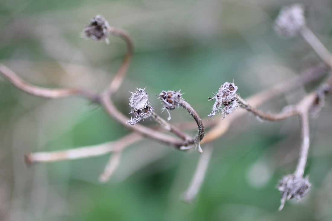
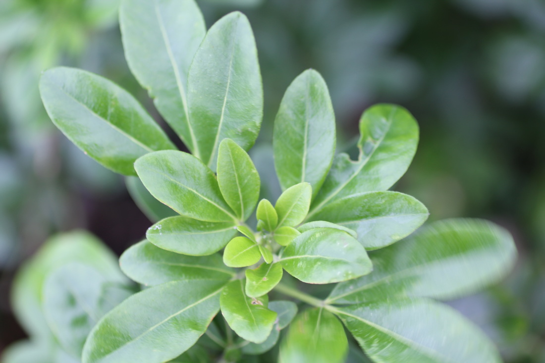
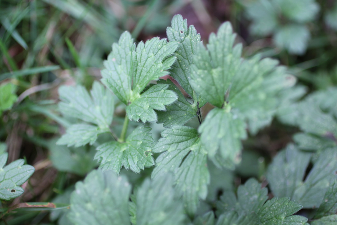
School photos


Ralph Eugene Meatyard
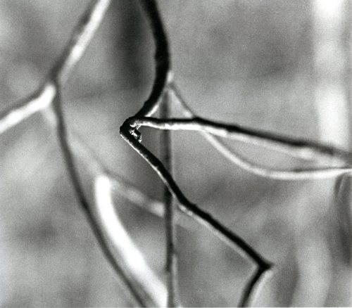
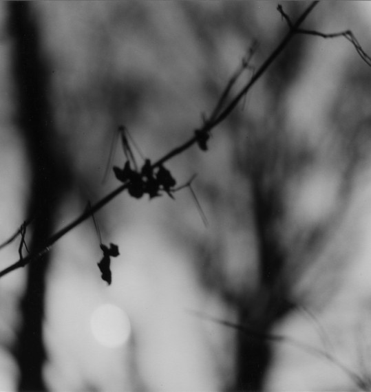


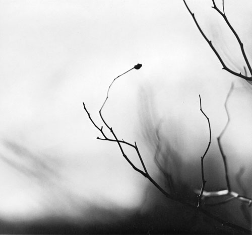
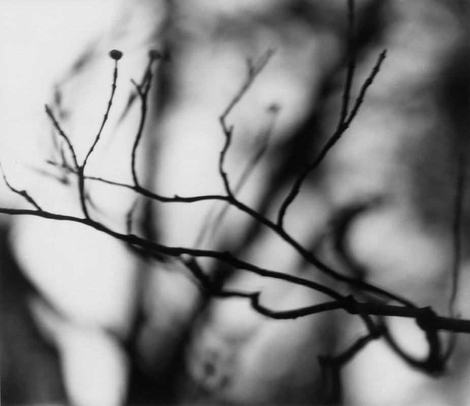
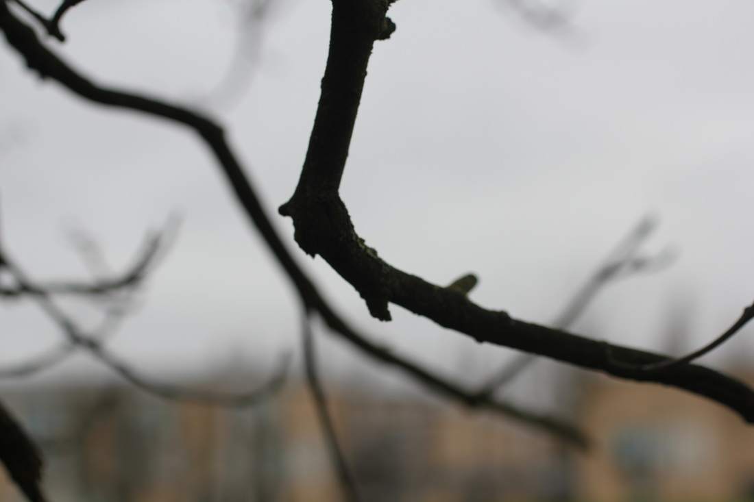
Ralph Eugene Meat yard was born in Normal, Illinos on may 19th 1925.After he Married he moved to Lexington, Kentucky to be an optician, the company he worked for also happened to sell photographic equipment. He took this opportunity to explore the impressive world of photography. Eventually he deserted the optician trade and became a photographer. Creating images where the background is out of focus drawing your attention the the foreground, which usually the subject is a twig. He called his photographic collection ' Zen Twigs'
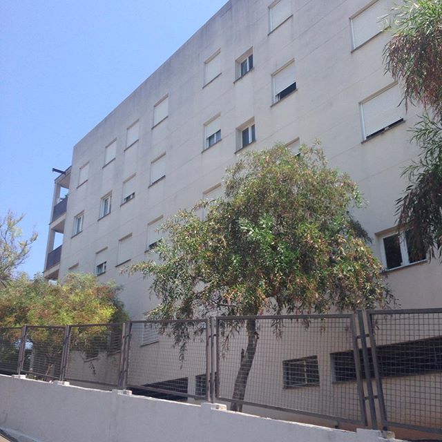
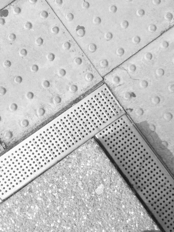
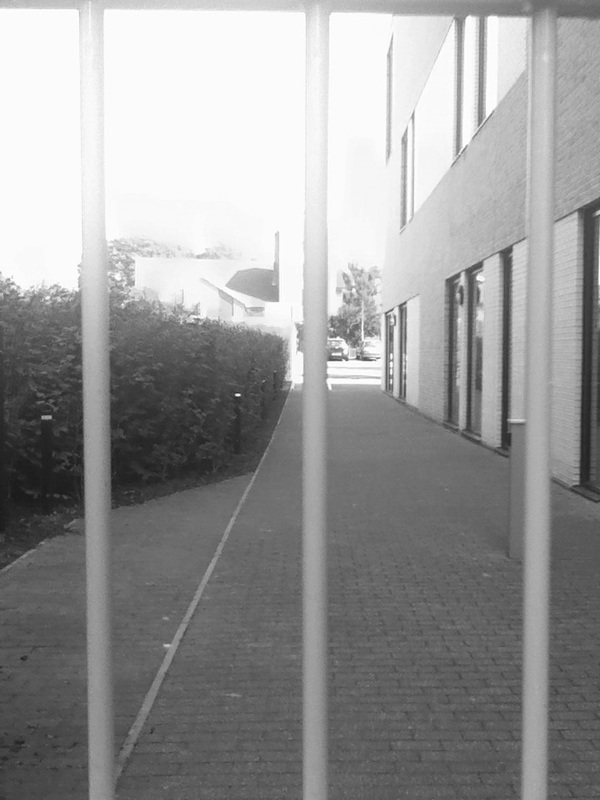
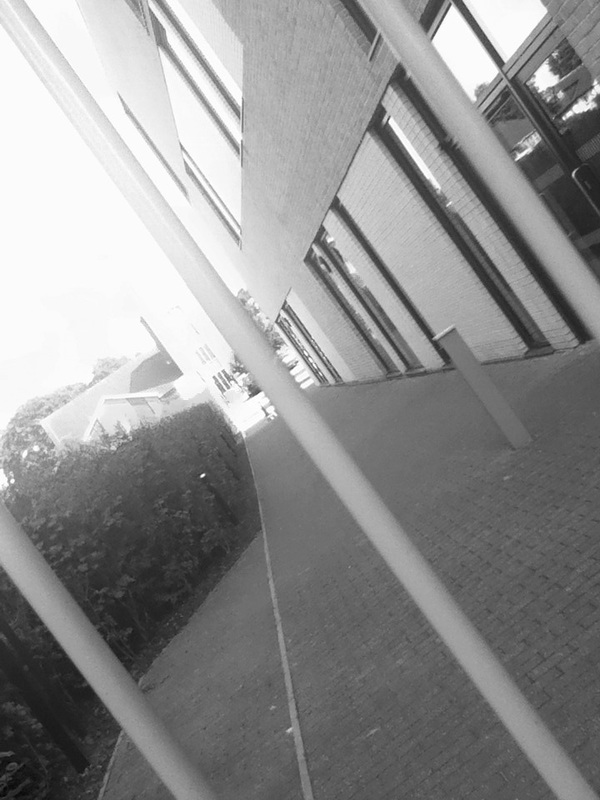
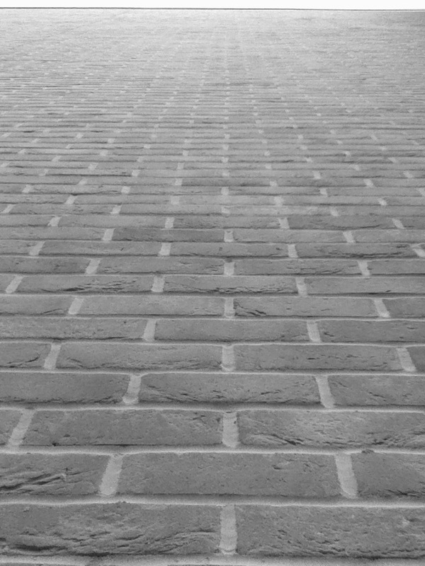
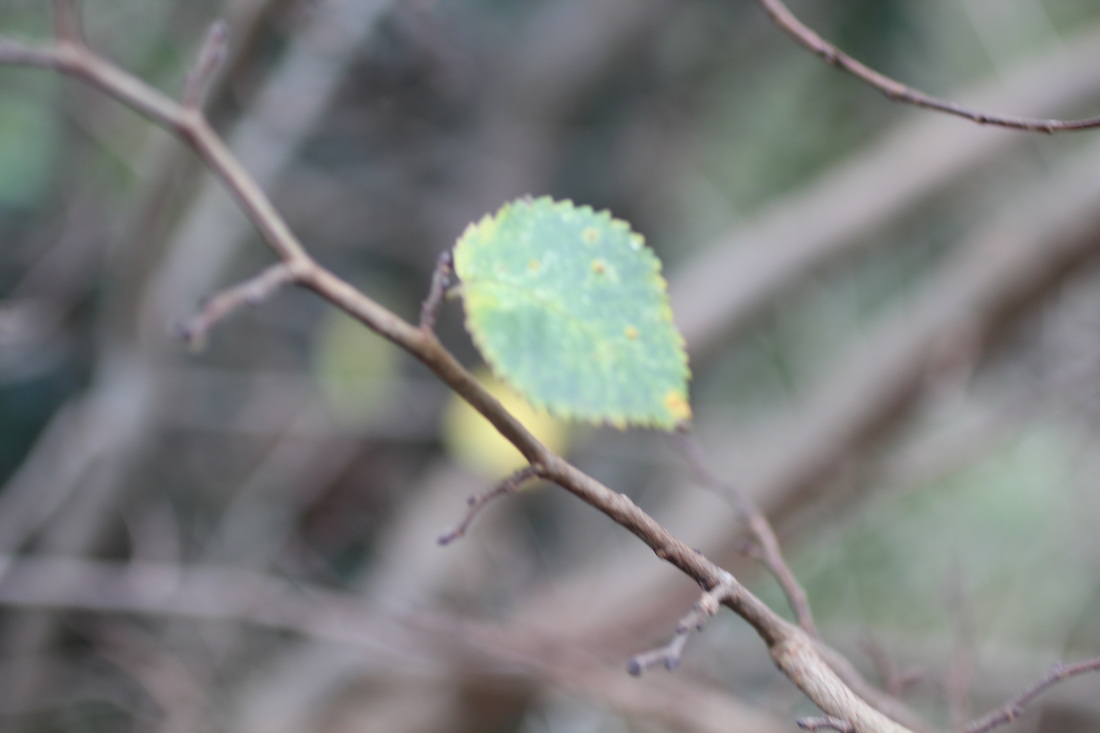
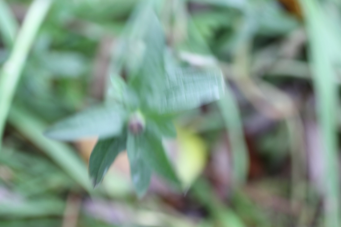
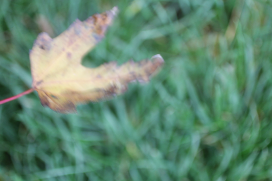
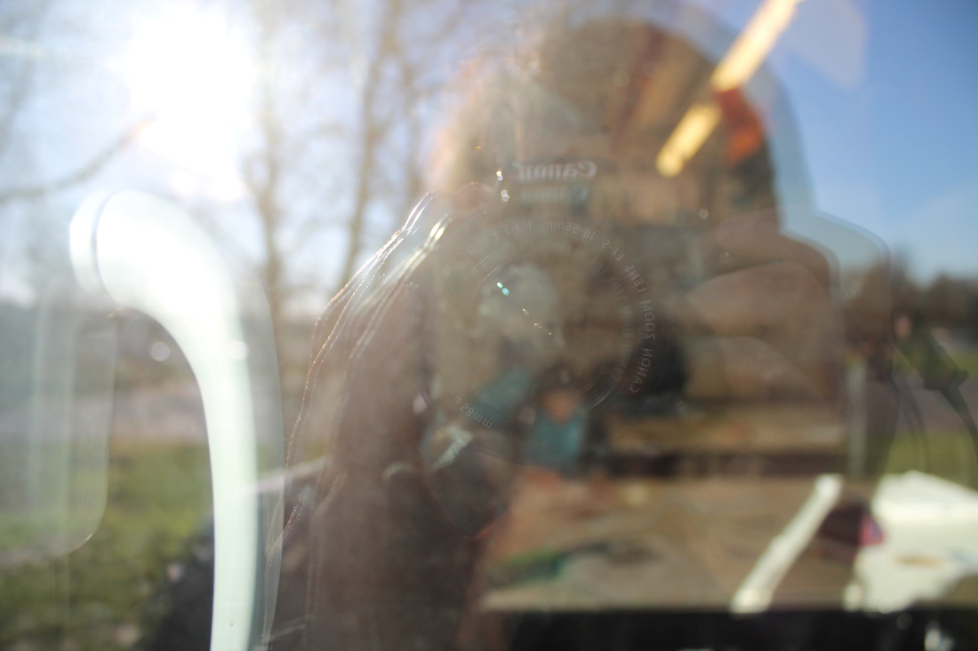
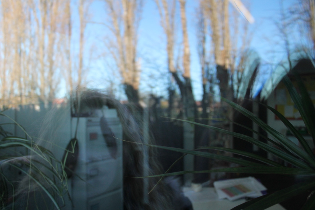
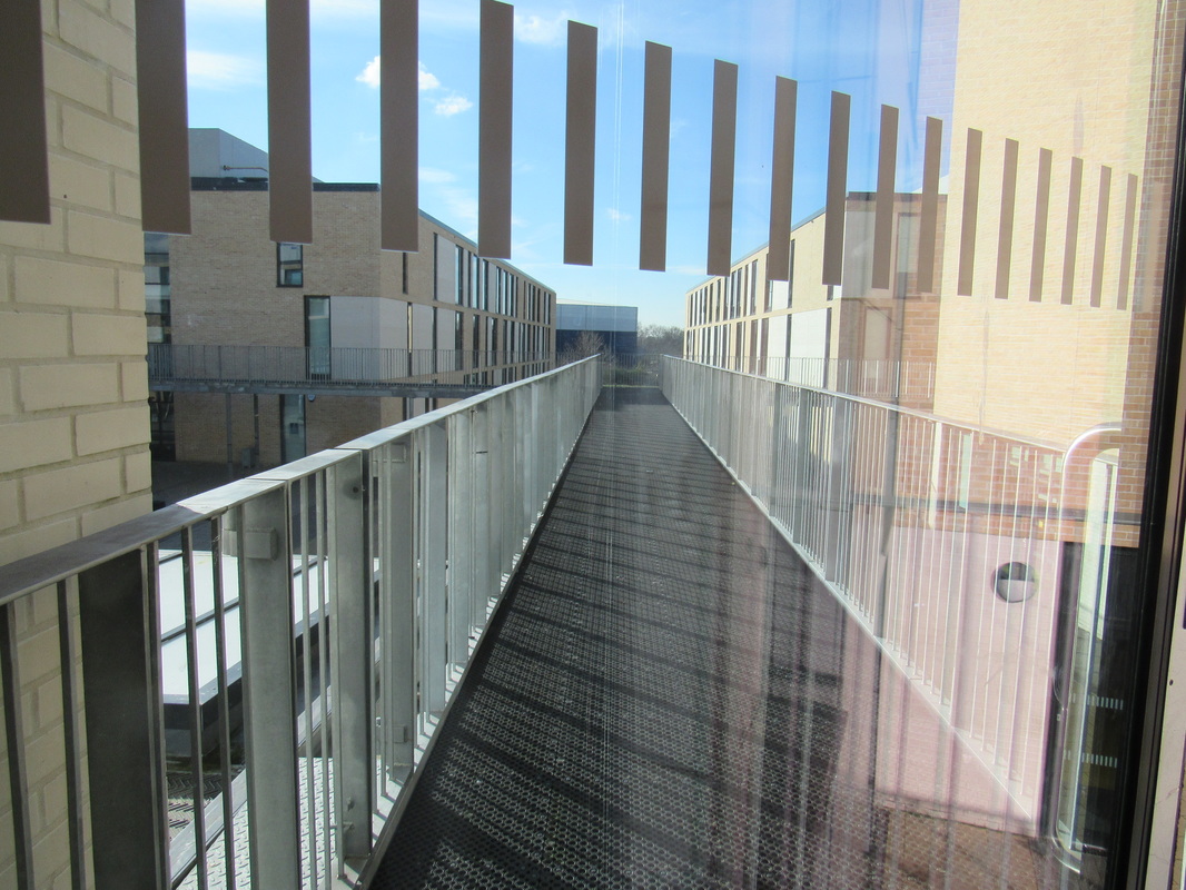
School Photos


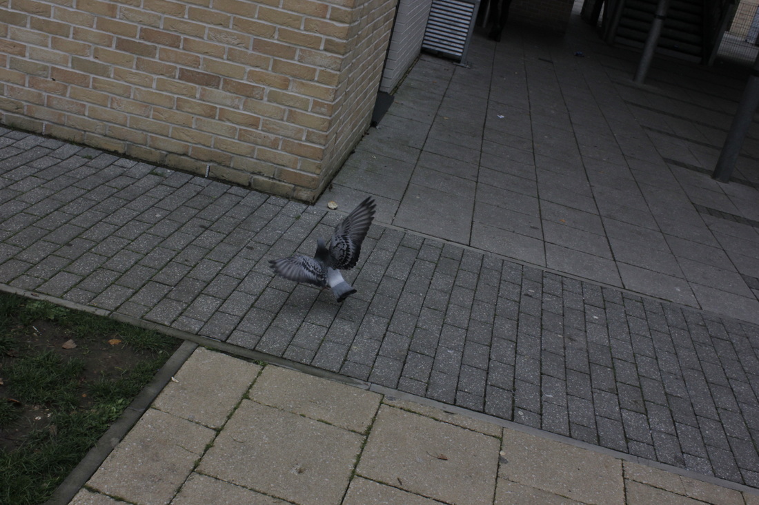
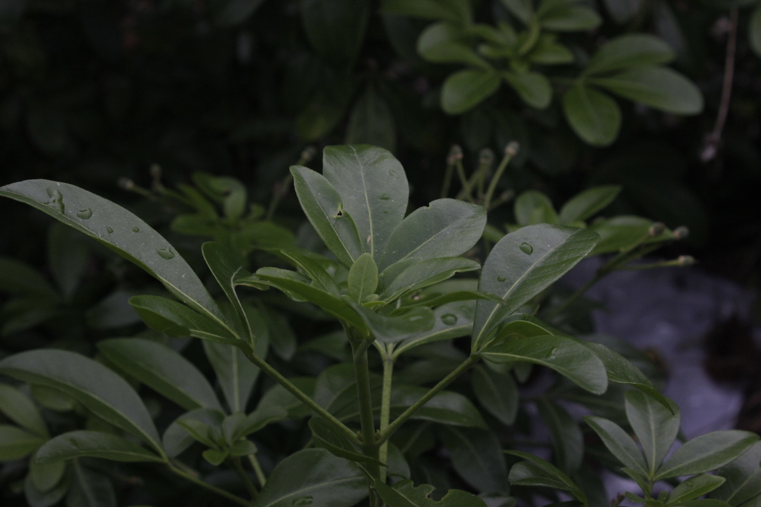
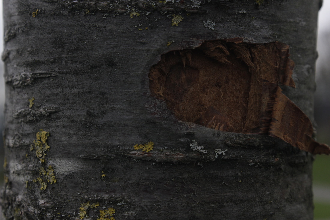
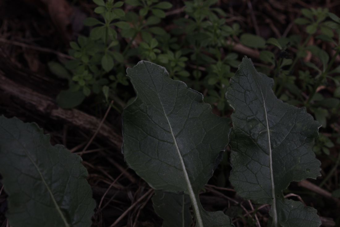
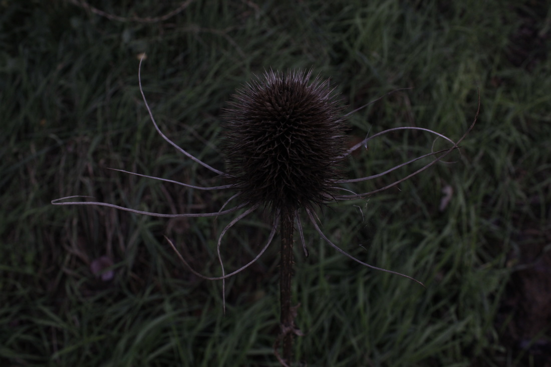
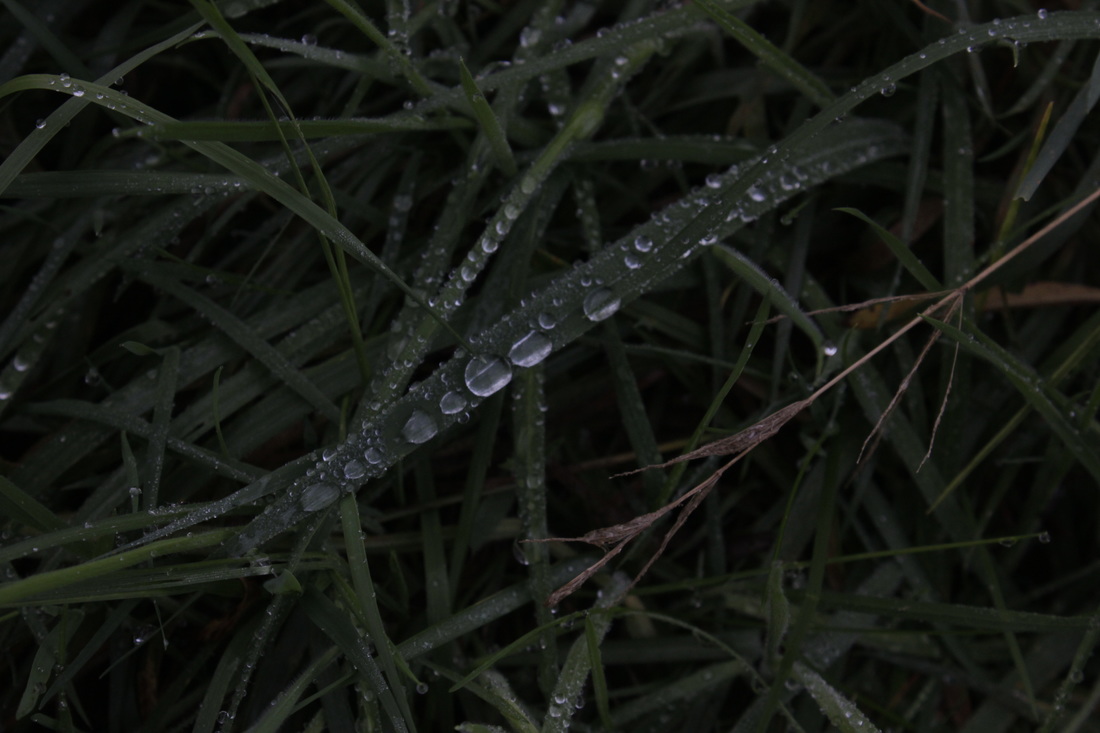
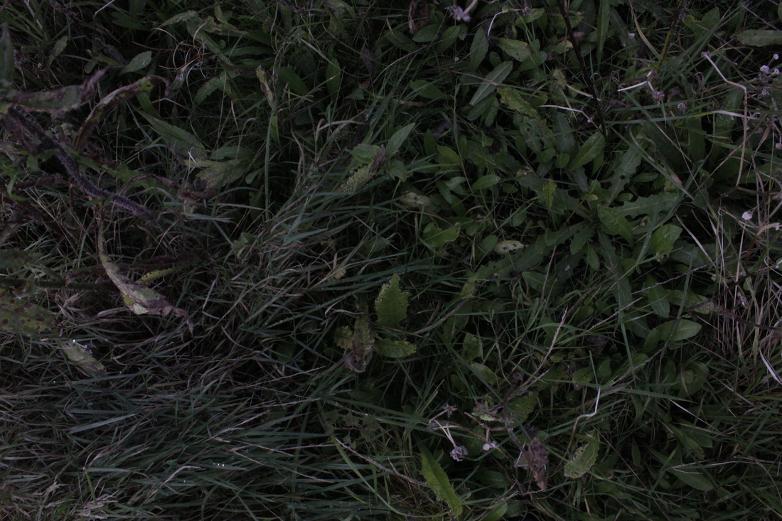


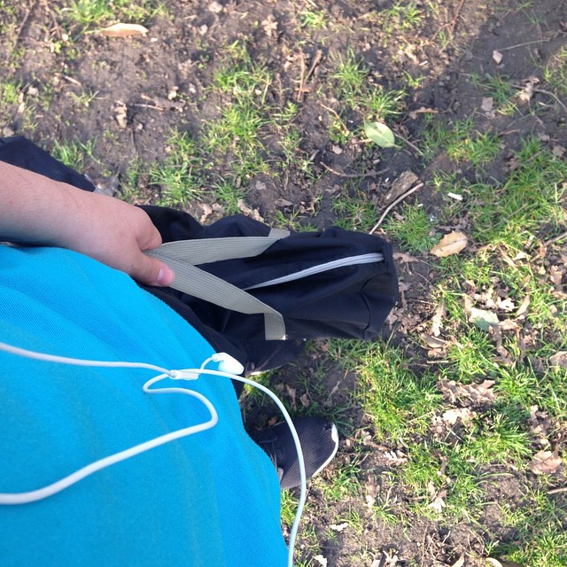
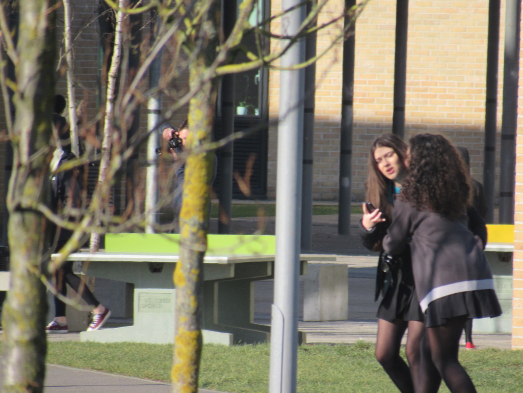
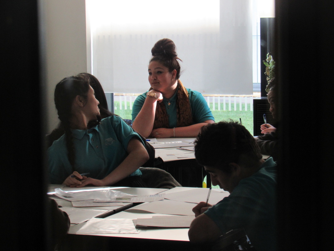
In-school DLSR Photos Friday 11/12/15


In focus: Saul Lieter
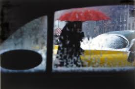

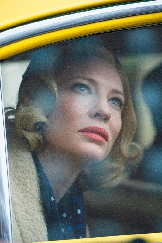

5 Characteristics of Leiters pictures include:
- He focuses on the background, instead of the foreground
- In his photographs there is almost always an object obstructing the background.
-Most of the obstructing objects are out of focus. but the backgrounds are in focus
-As he is an ex-artist his photographs are like paintings.
-his photos are like how the camera sees things differently to your eyes,
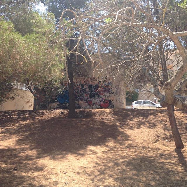
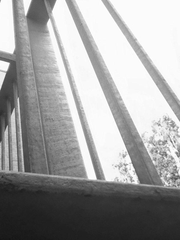
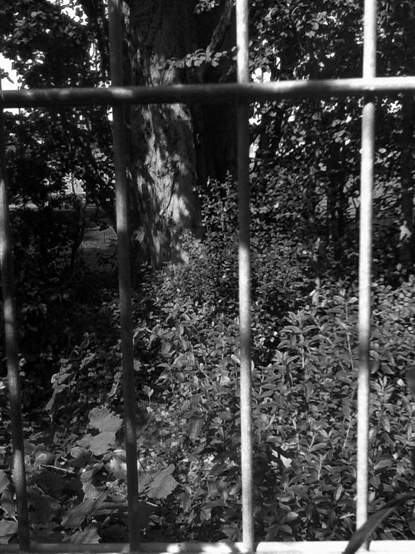
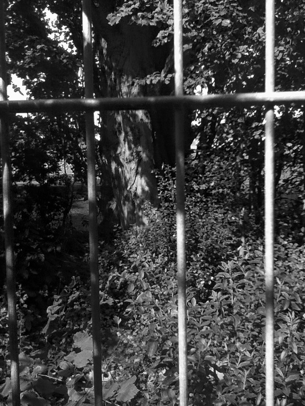
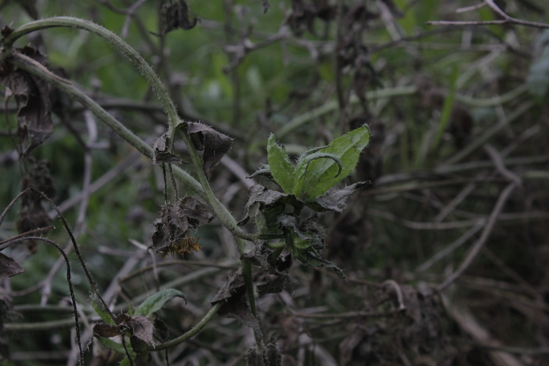
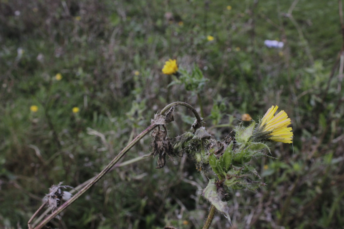
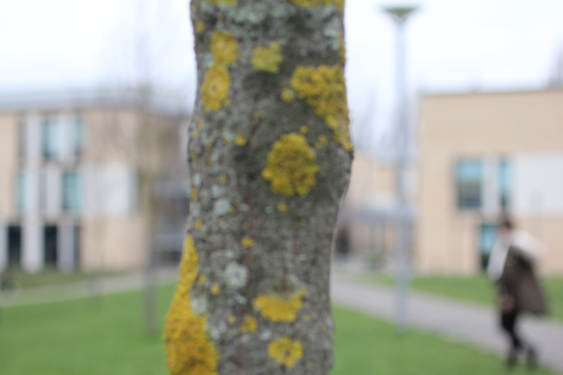
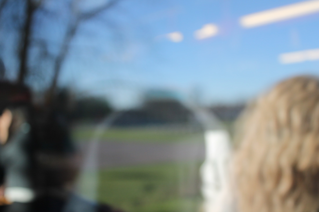
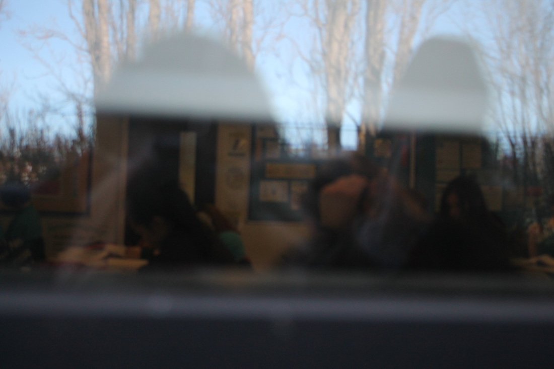
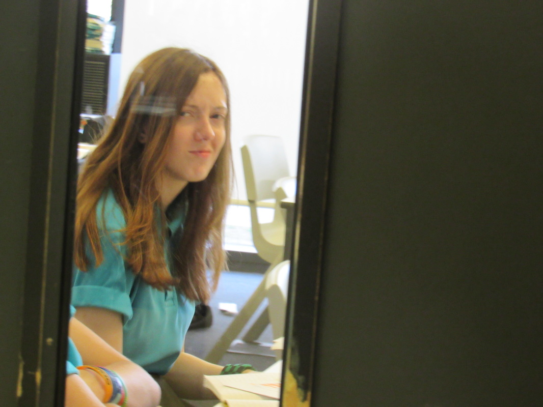
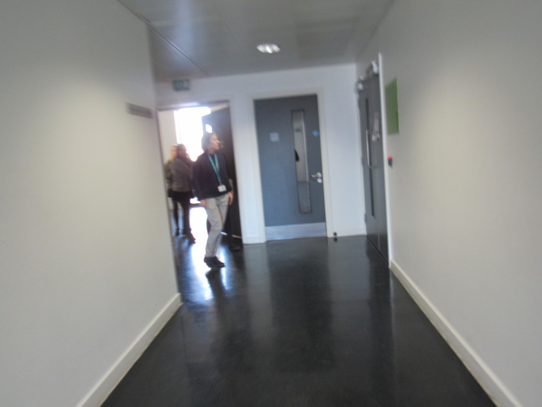
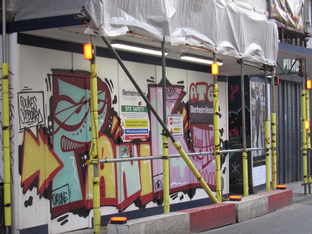
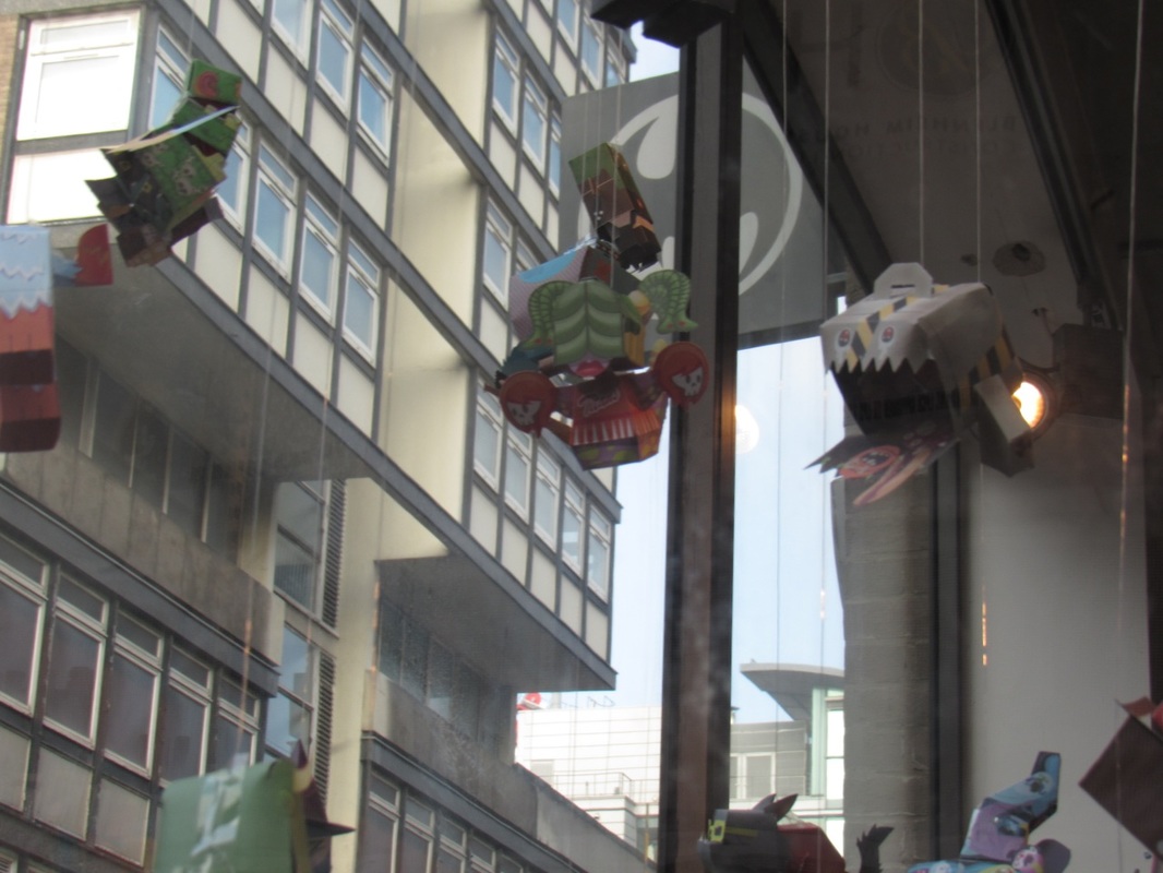
School Photos 22nd Jan


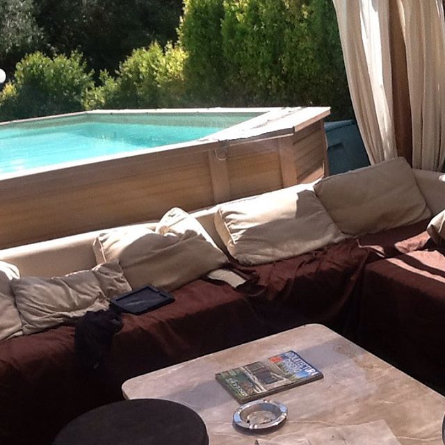
Homework Photos: Luminere 2K16

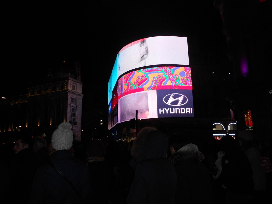

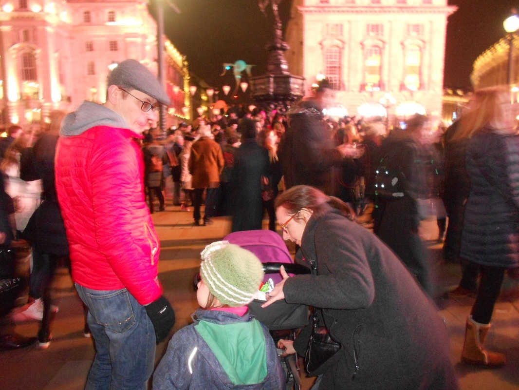
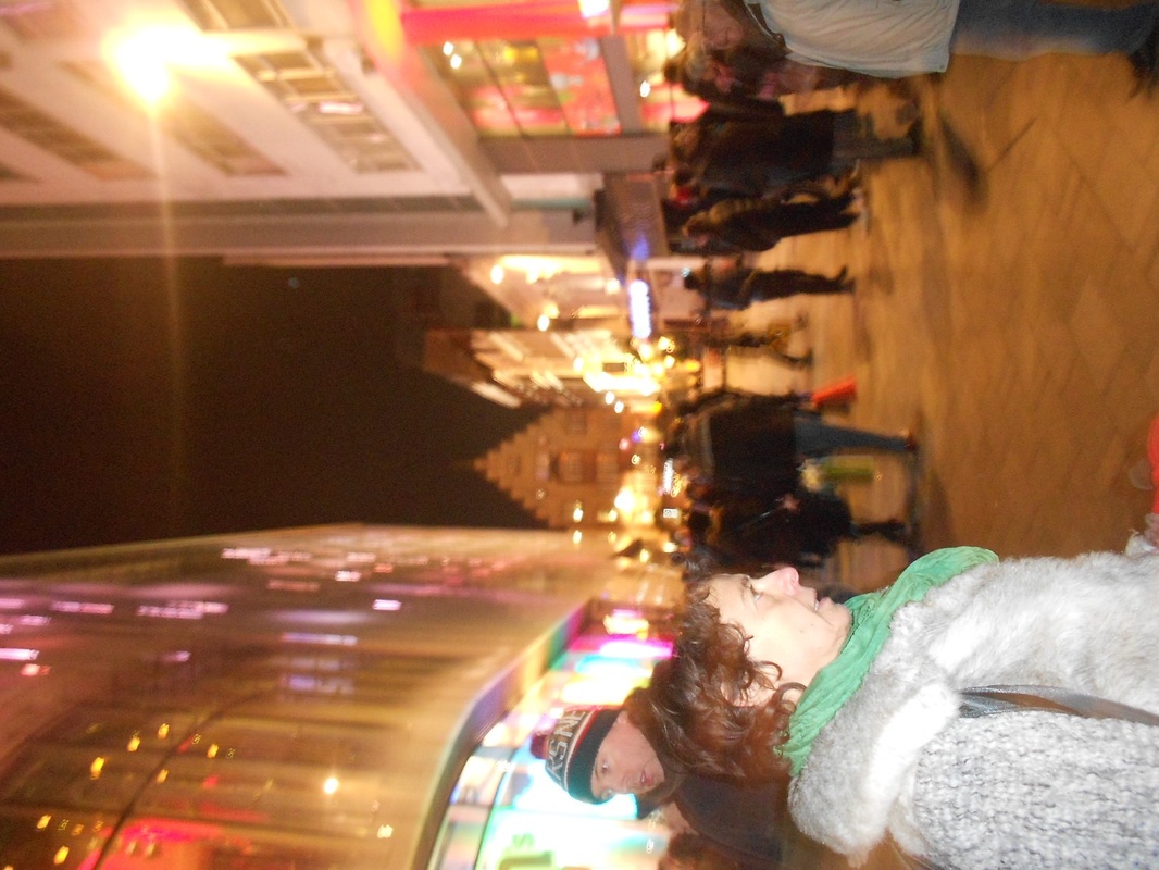
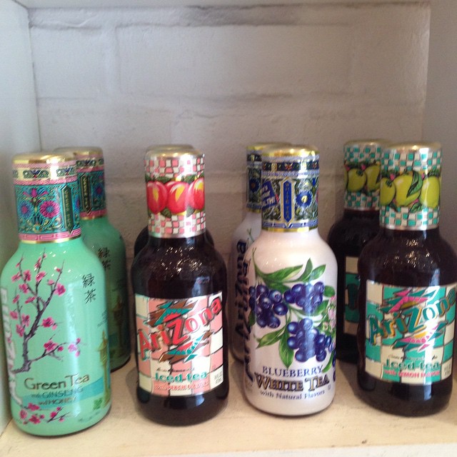
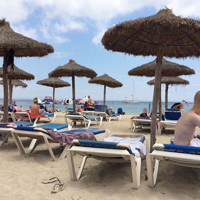
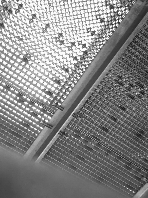
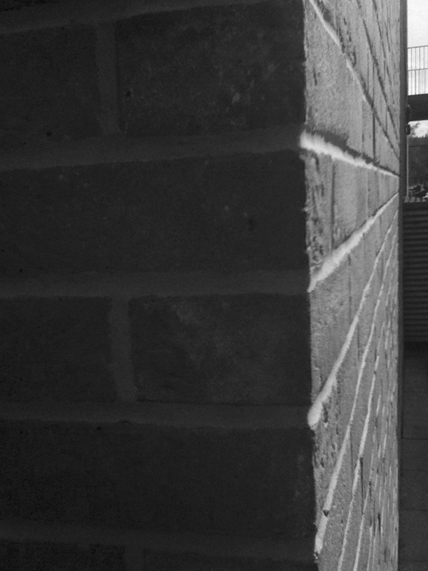
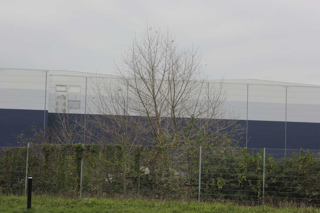
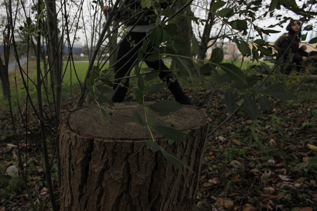
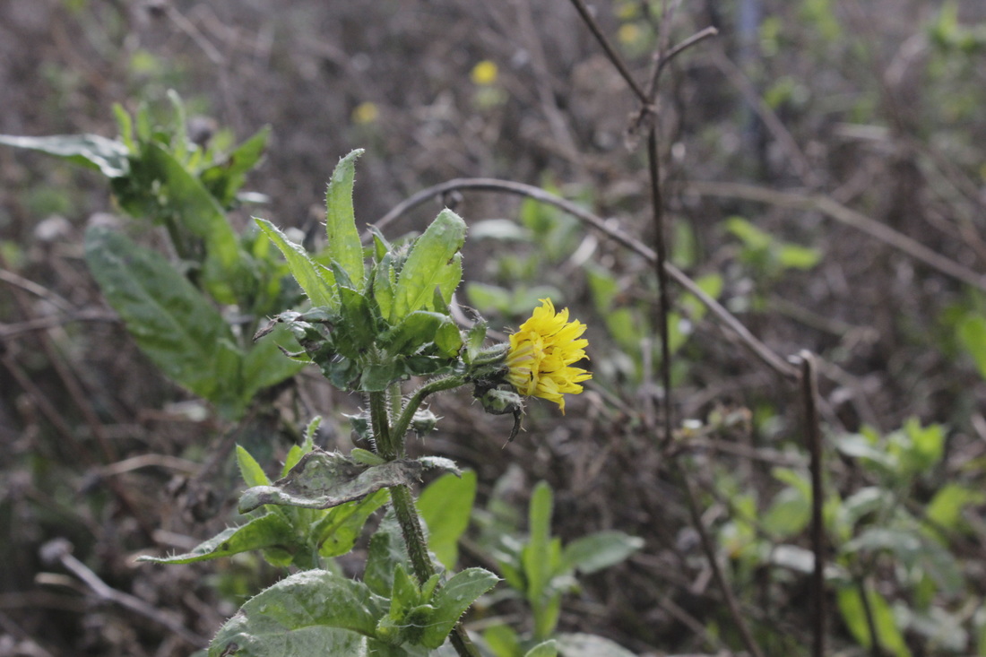
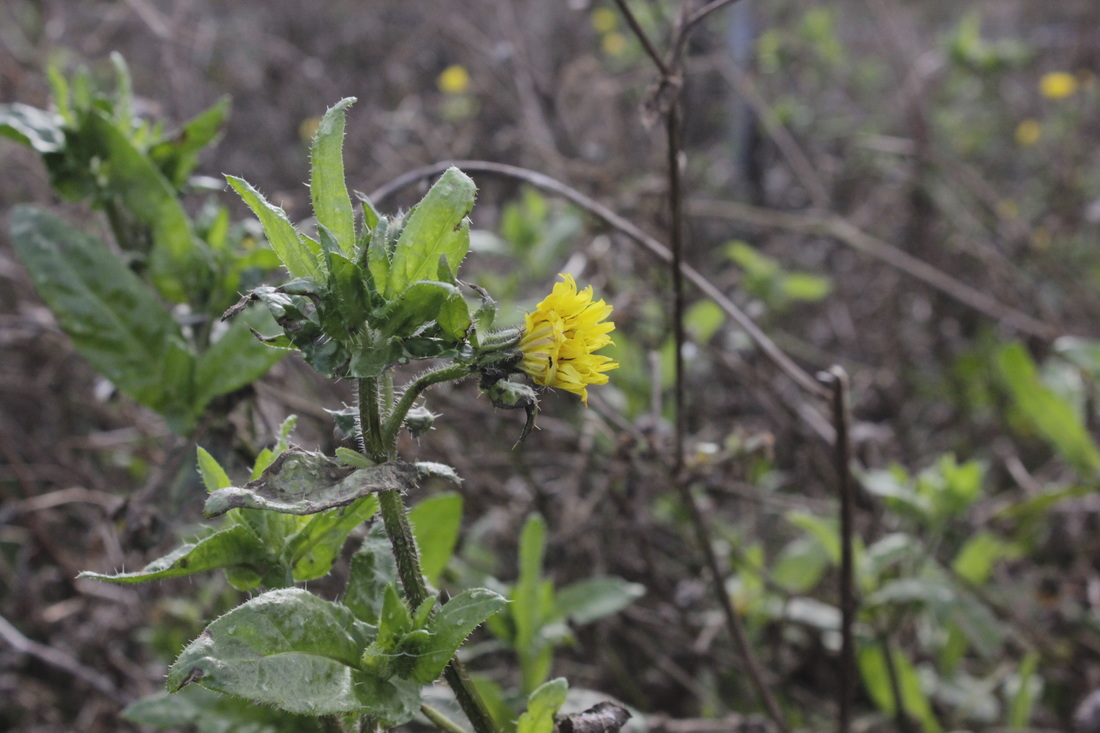
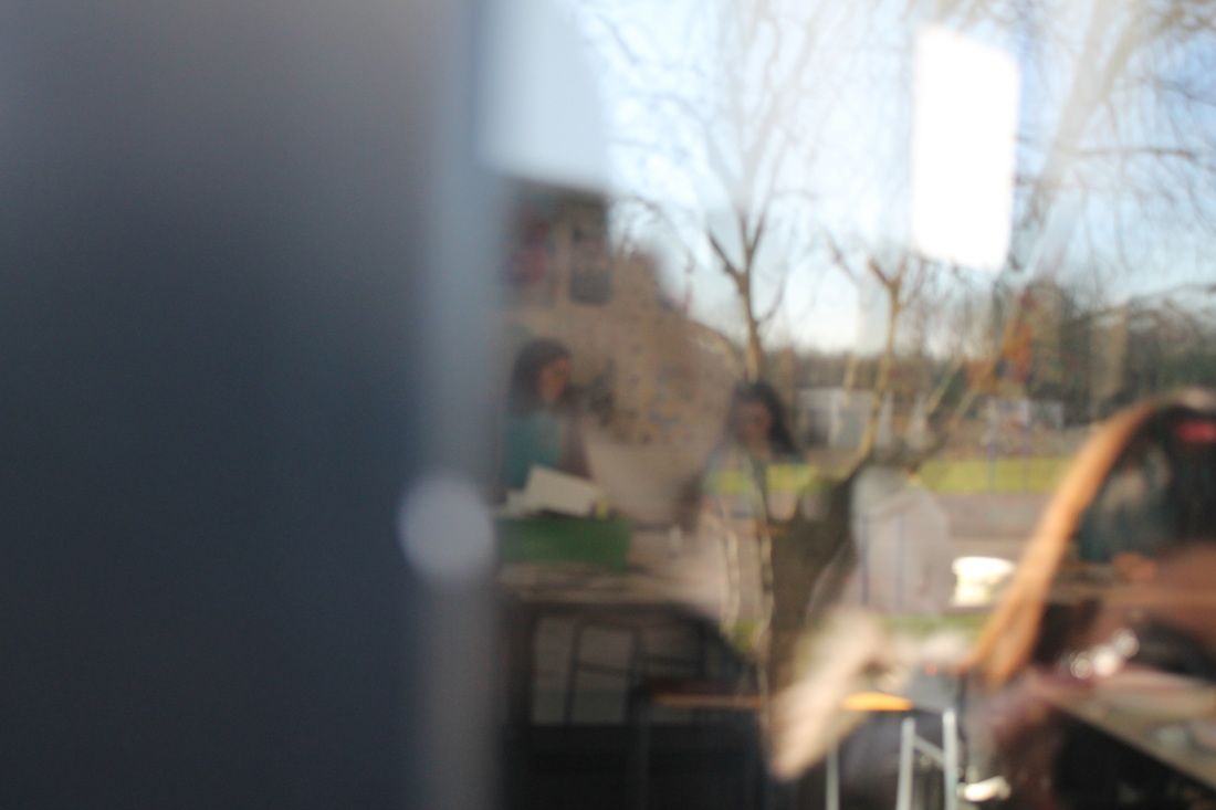
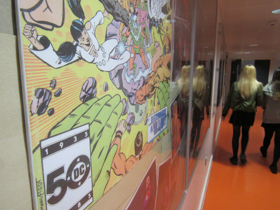
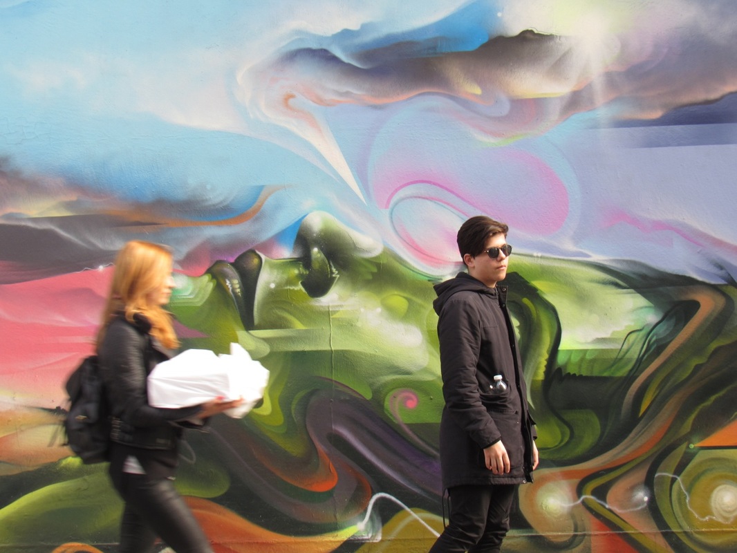
School Photos 29th jan

Threshhold Concepts
These are the threshhold concepts we have been looking at throughout the project. We have to keep them in mind during evaluations and when taking photographs.
Cameras ‘see’ the world differently to the way we see the world with our eyes. The photograph (whether this is a printed image or pixels on a screen) can sometimes ‘disappear’ because photography is able to create an almost perfect illusion of reality. We tend to see only the subject of the photograph rather than the photograph itself. However, all photographs are, to some extent, abstractions. The flatness of photographs creates relationships between objects that may not have existed in reality. All photographic images are shaped by the technology the photographer chooses and by a process of selection, editing and manipulation. Each and every photographic image is therefore made or constructed, rather than being a window onto the world.
|
Photography is unlike other visual arts in that it begins with a world full of things rather than with a blank slate. Photography is more an art of selection and translation rather than of invention. However, photography is also an art of production, not just reflection. It does things to the subjects it represents.
|
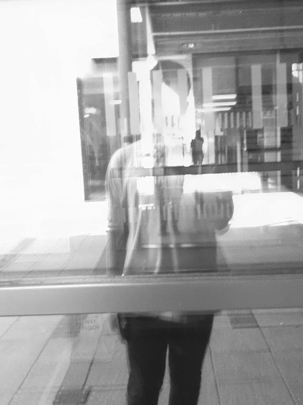
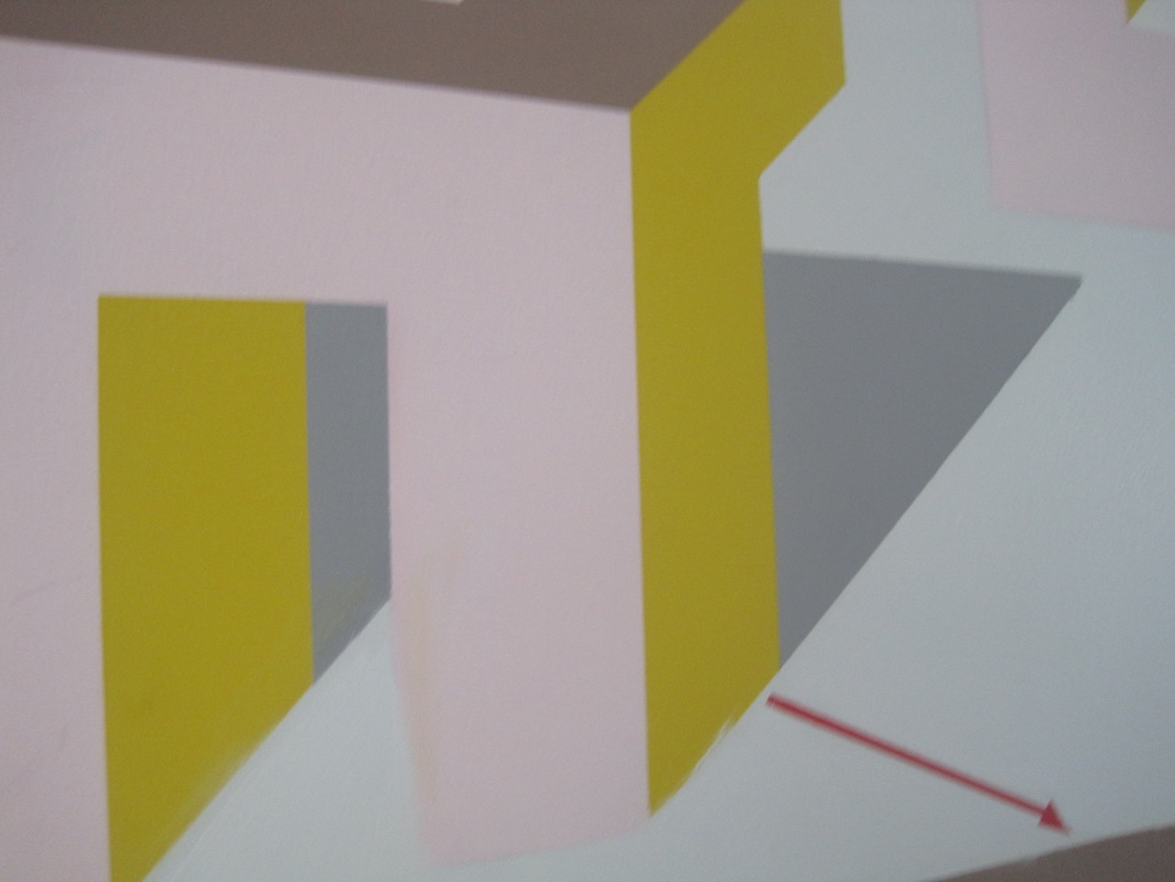
Saul Leiter inspired paintings
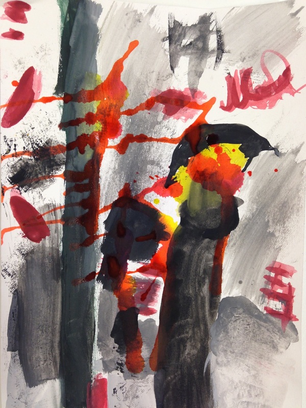

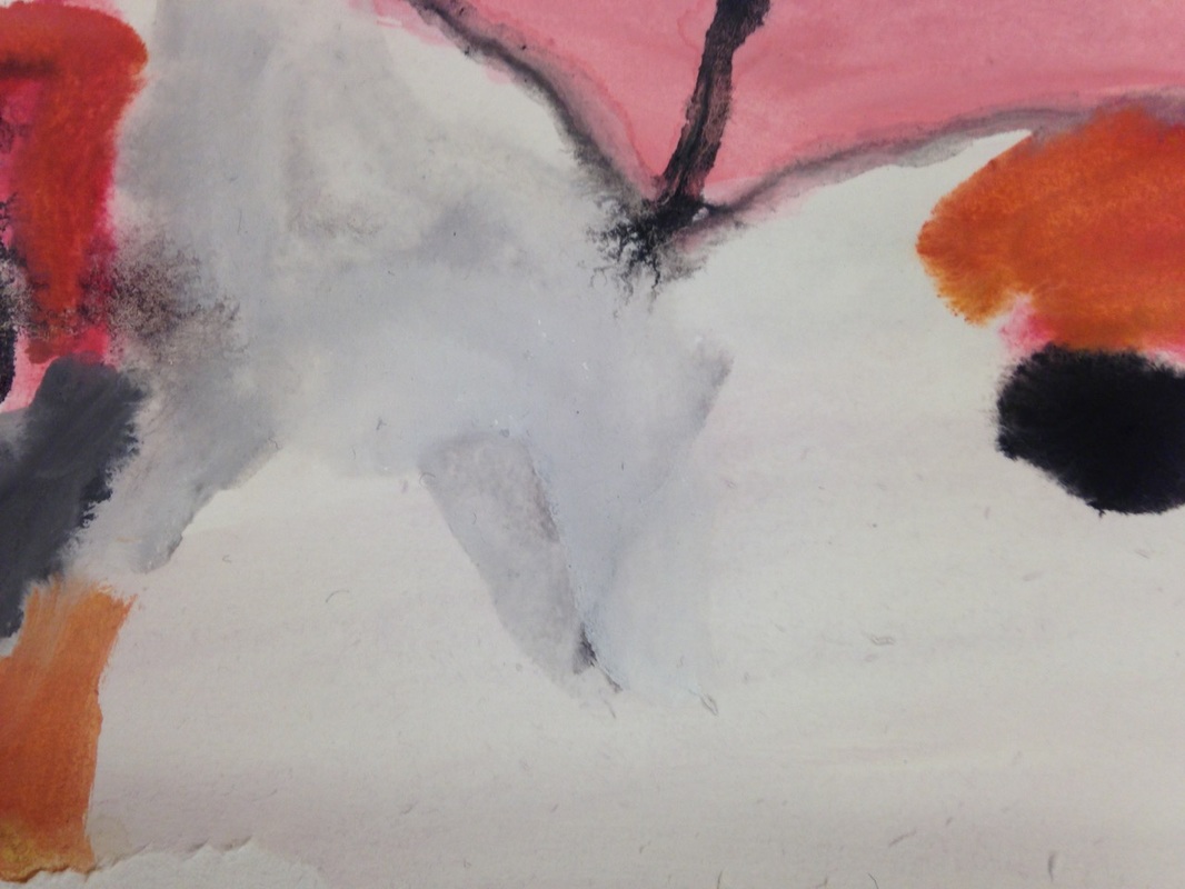

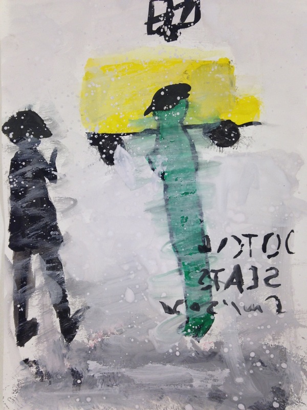

In lesson we were asked to show Saul Leiters photographs through paintings. I chose to replicate 3 images which I thought would not be too hard to paint. The top images I created at general outline of all colours mostly focusing on the colours black and yellow. The second image I found had to replicate because of the blank space. The third painting and photograph was the first one I chose and the one I feel that came out the best. I like how I re-created the effect of glass buy applying a watered down layer of paint across the image to give the effect of a pane of fogged glass.
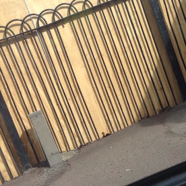
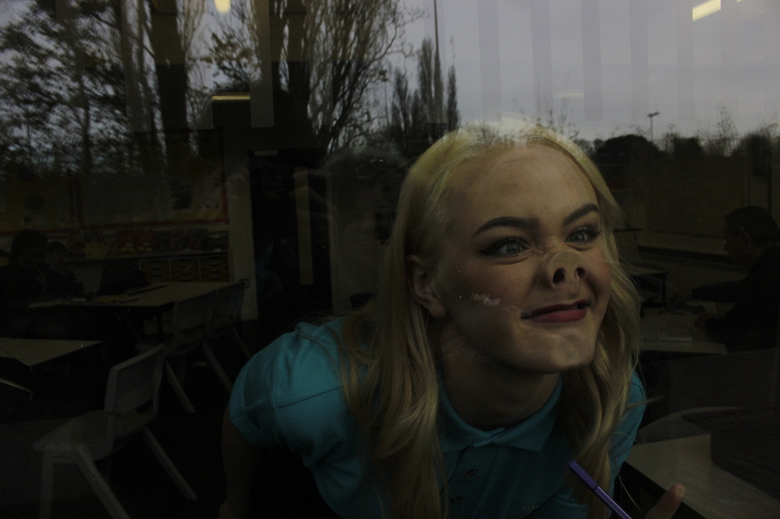
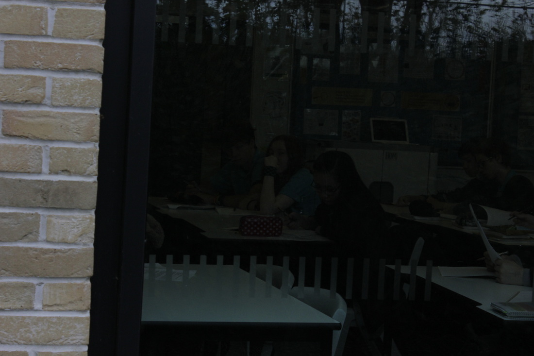
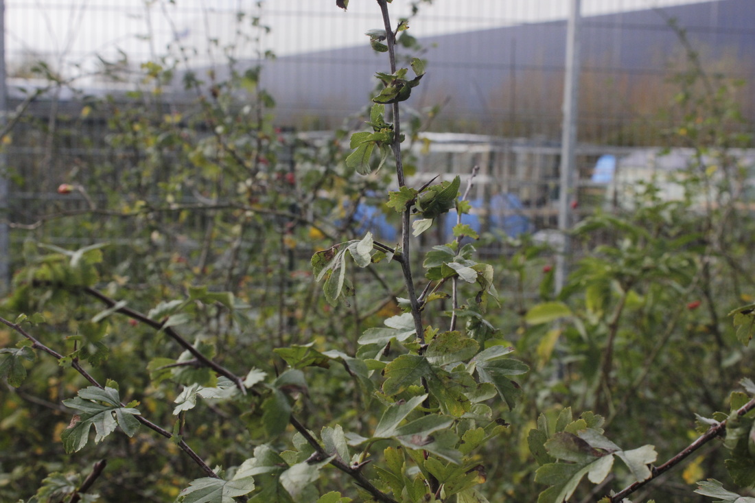
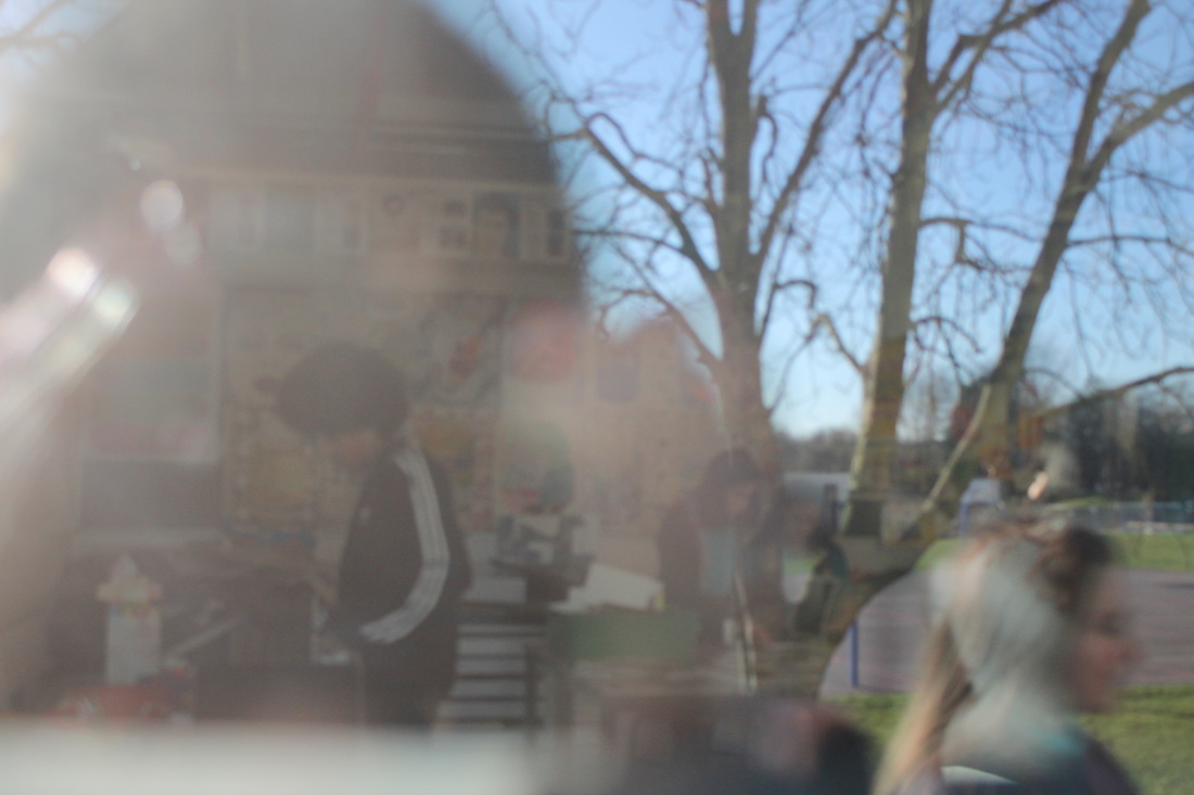
School Photos: Thurs Feb 11


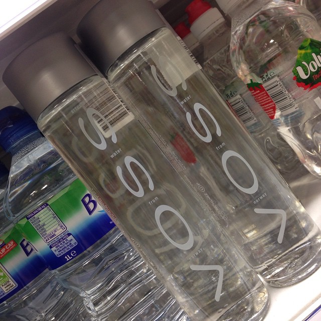
School Photos: Fri 4 Mar


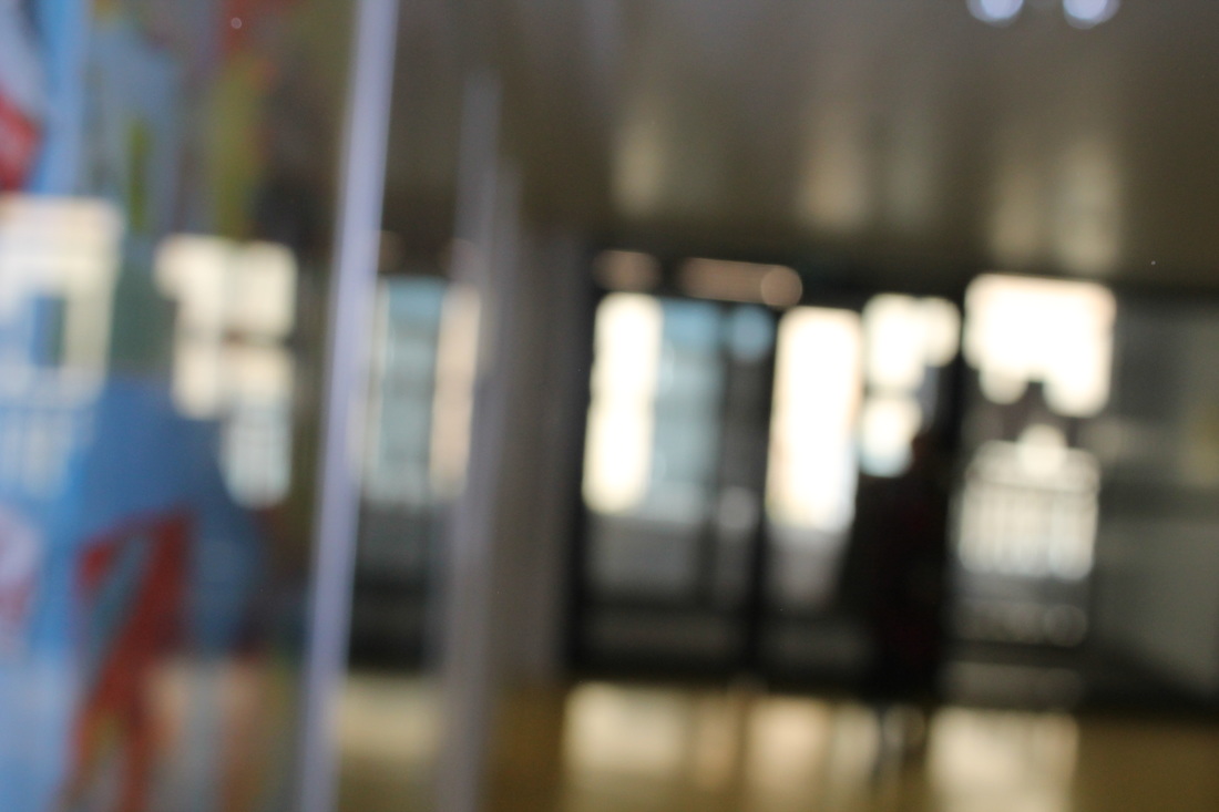
Trip To the Photographers Gallery, March 2016

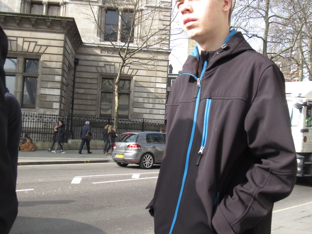
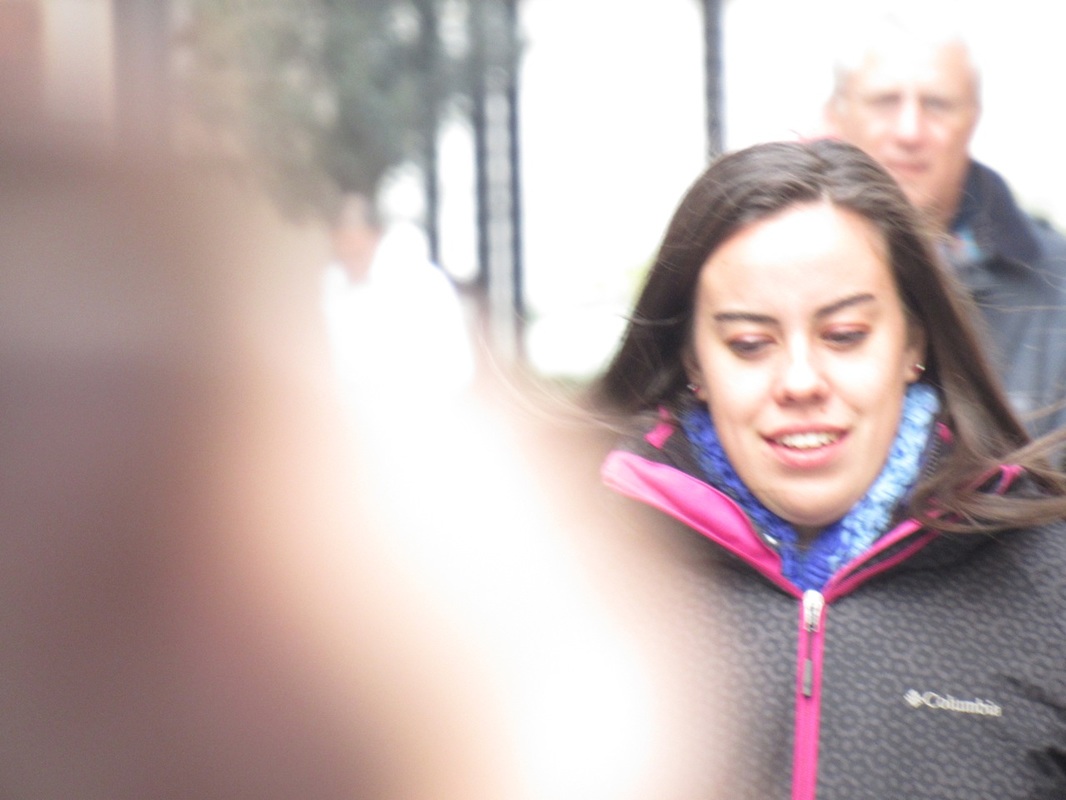
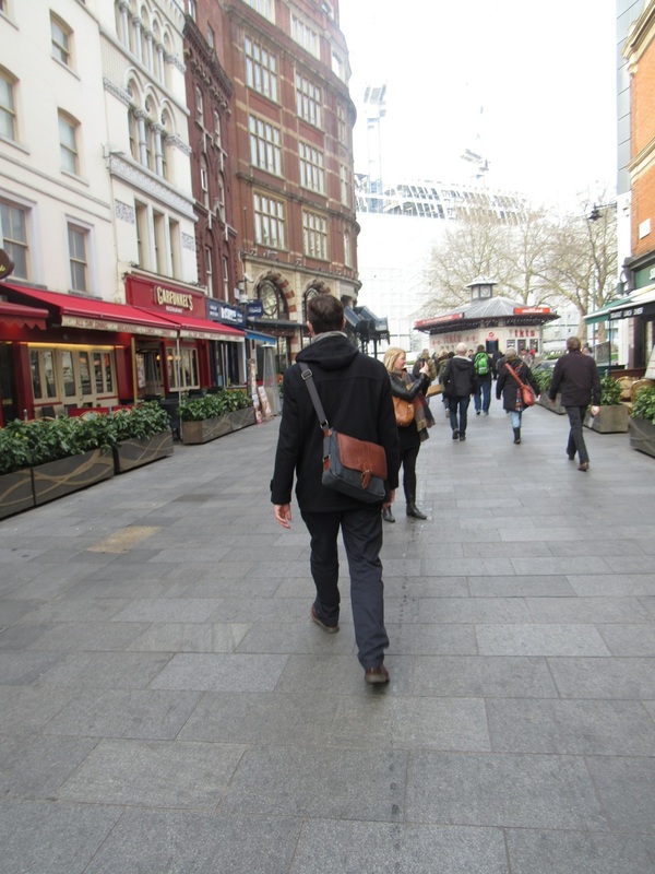
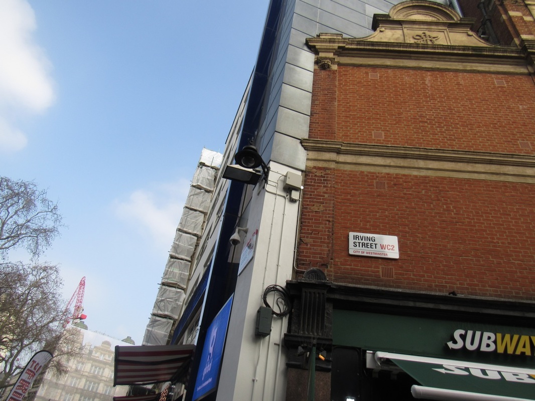

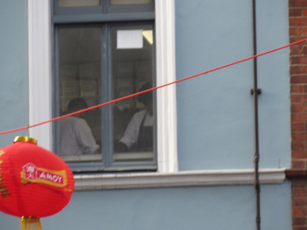


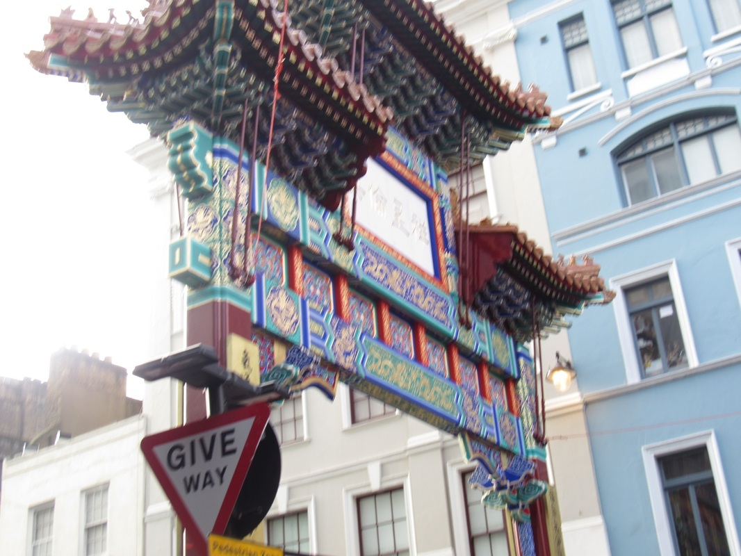
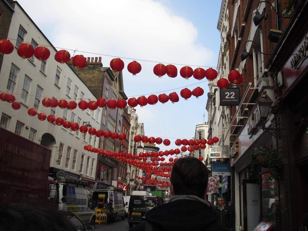
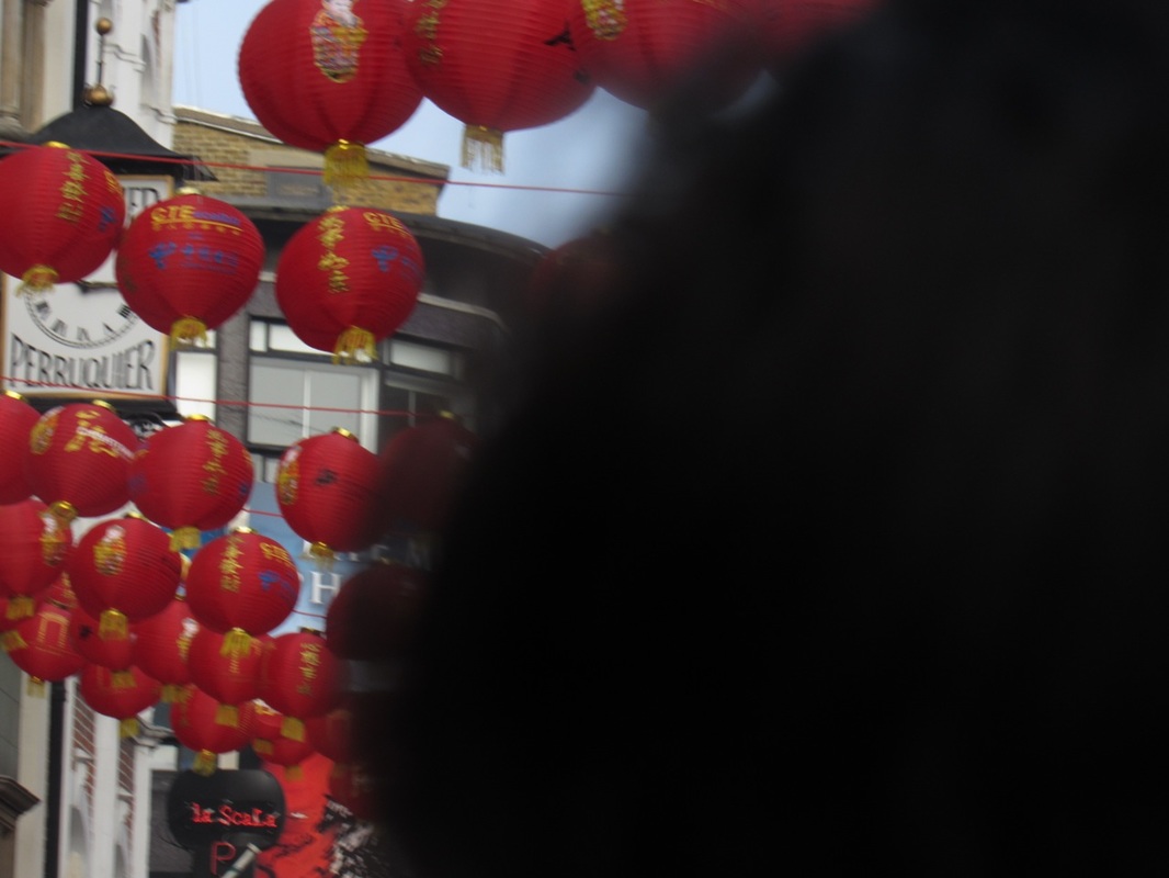
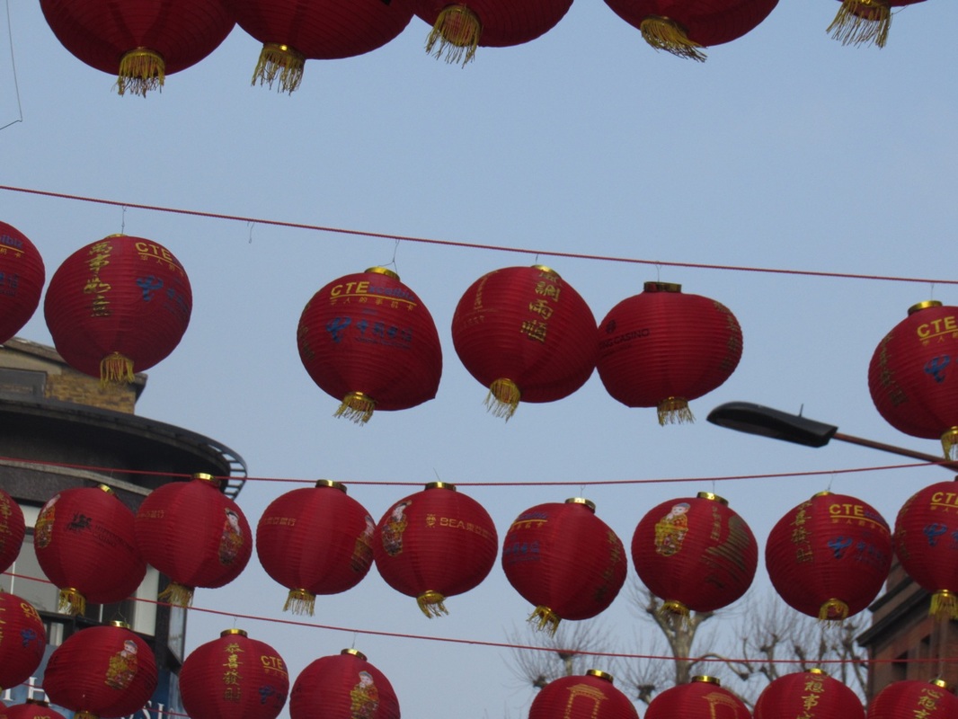
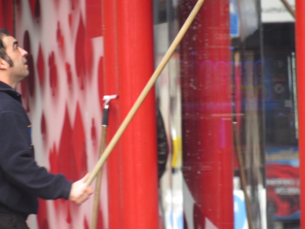

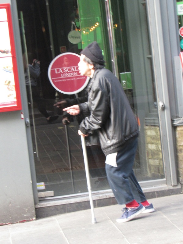


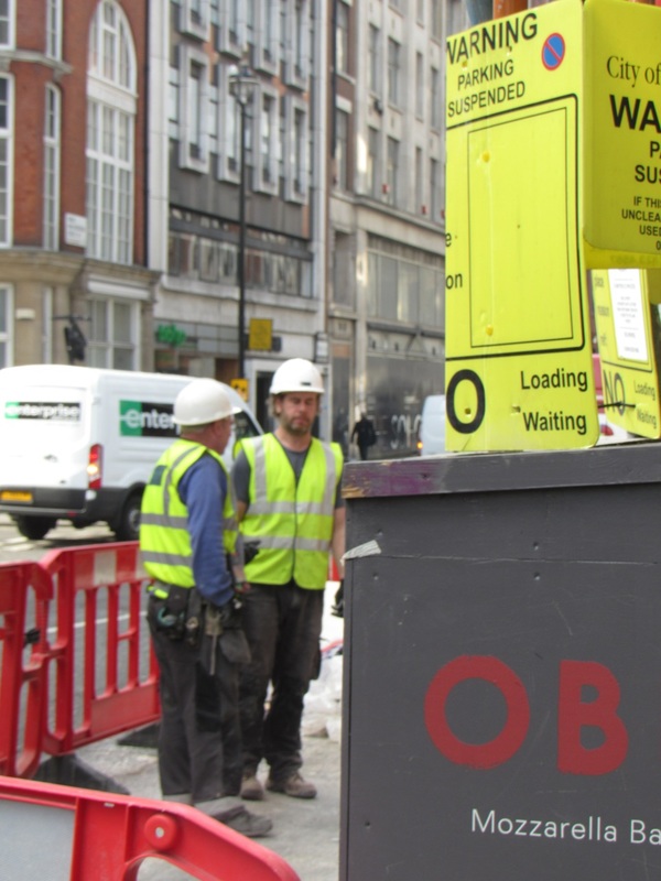

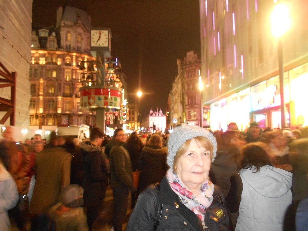
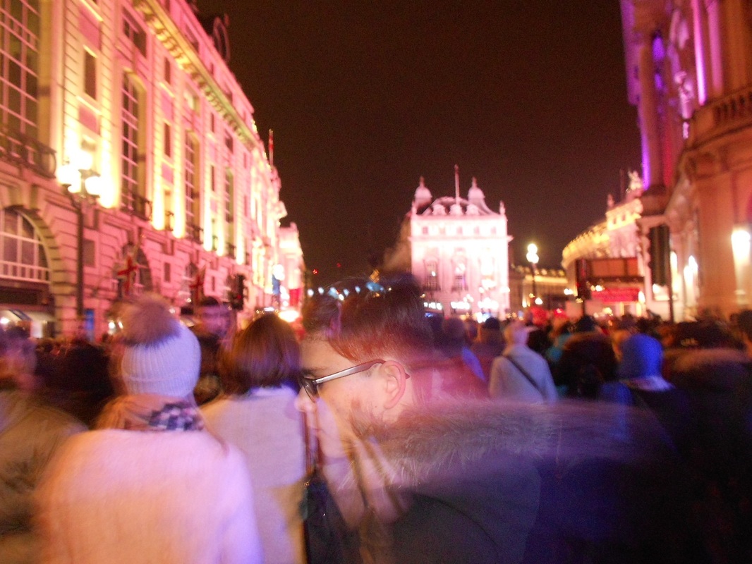
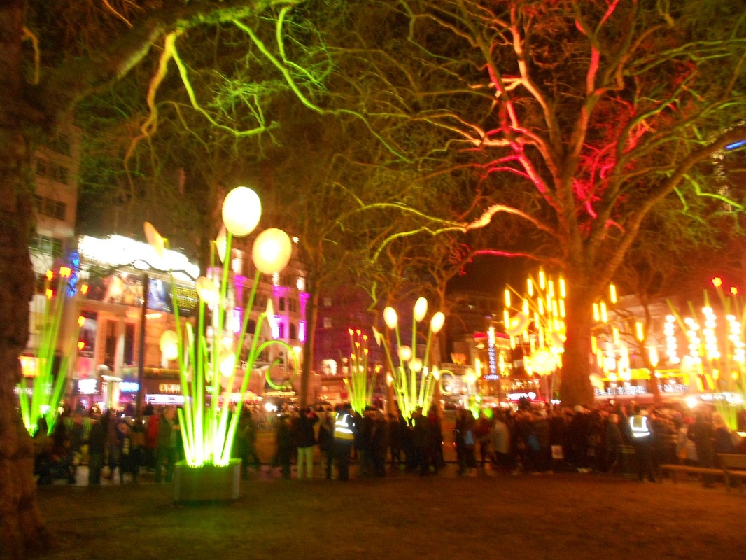
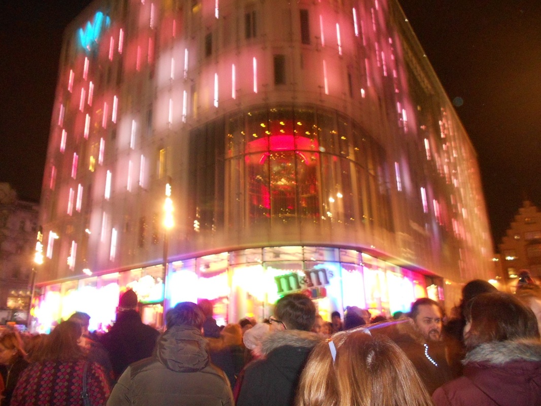
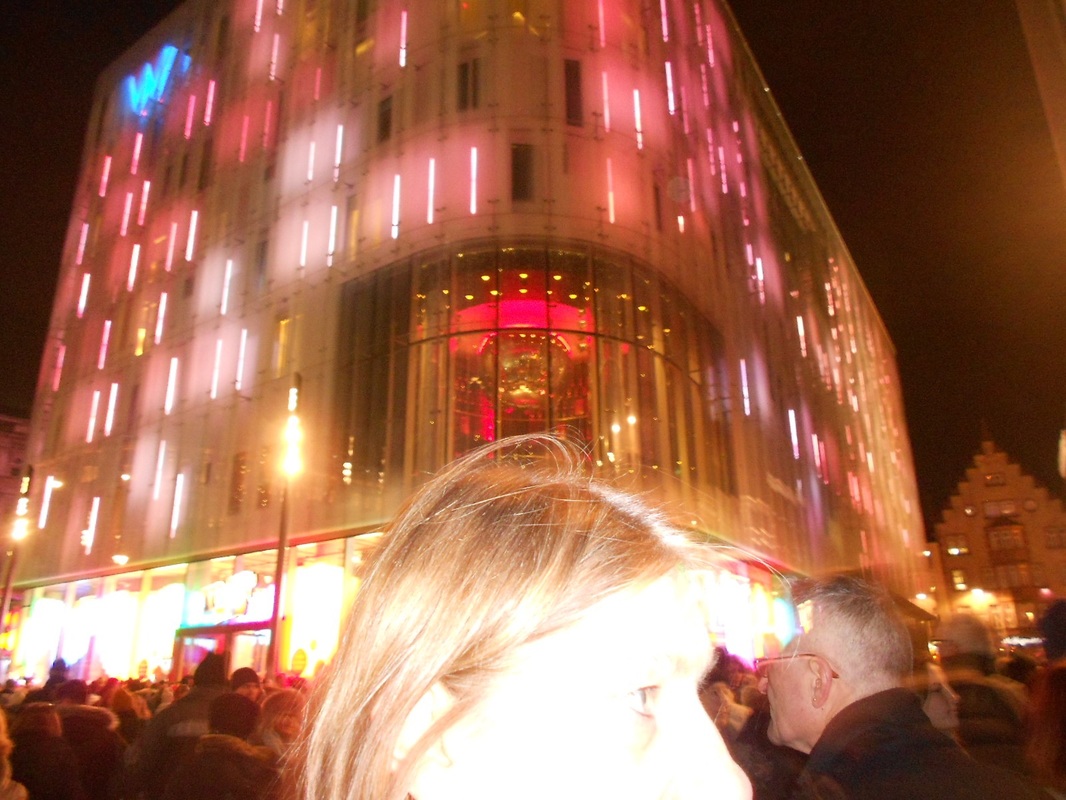
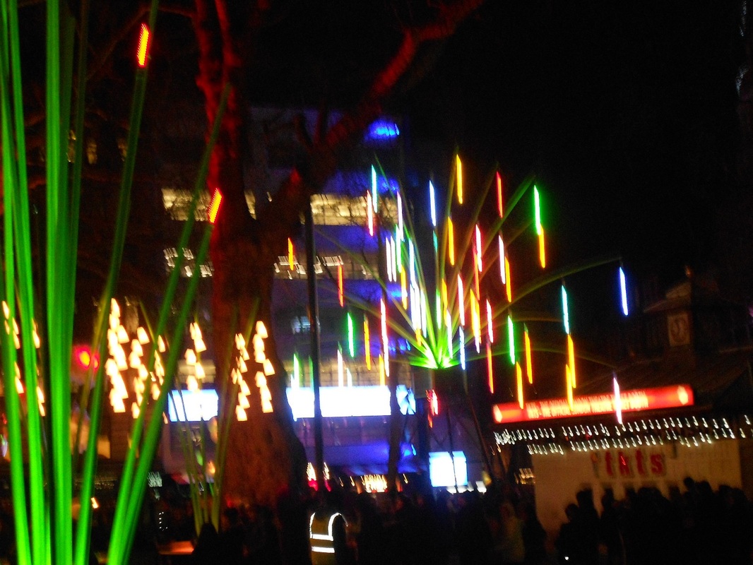
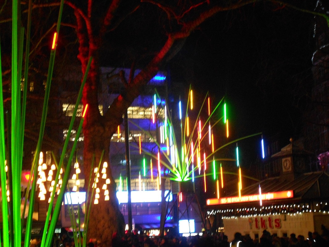
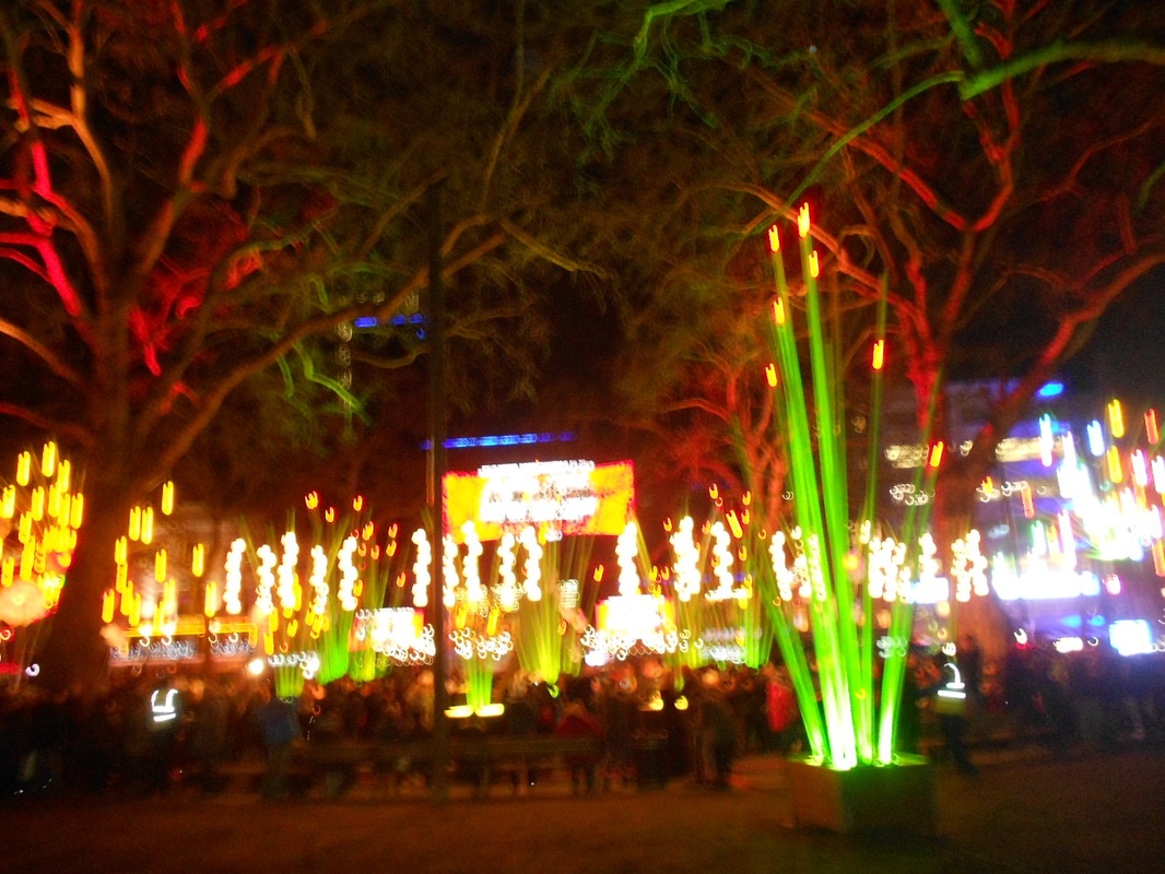
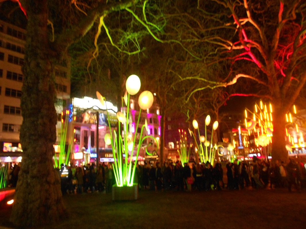
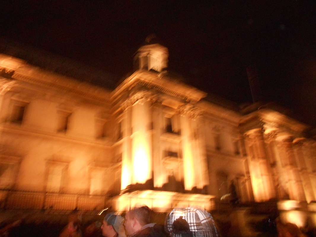
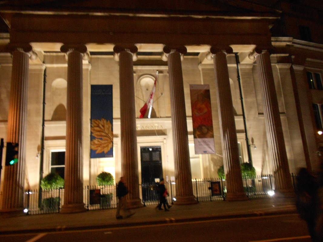
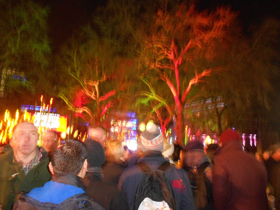
On friday the 11th of march, our photography class went on a trip to The Photographers Gallery to see the exhibition on Saul Leiter. We got on the train from Kidbrooke to Charing Cross at 9.30 and when we got off, we proceeded to walk to the photographers gallery, We walked through Leister Square, up across China town then we passed through Soho and up onto Great Marlborough Street, which runs behind the east side of Oxford street.
Once we reached the gallery, we walked up the never-ending stairs and eventually we reached the exhibition room. We were given a task to pick two pictures and quickly sketch them. After spending a while browing in the gallery we walked back the way we came and crossed the footbridge at Embankment and arrived at Southbank
Once we reached the gallery, we walked up the never-ending stairs and eventually we reached the exhibition room. We were given a task to pick two pictures and quickly sketch them. After spending a while browing in the gallery we walked back the way we came and crossed the footbridge at Embankment and arrived at Southbank
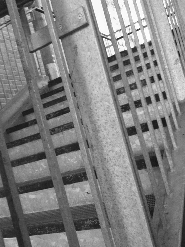
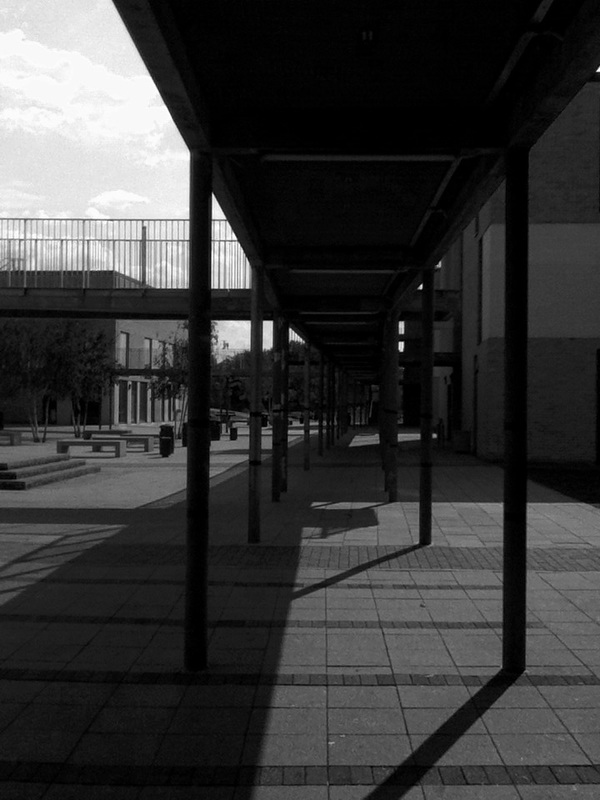
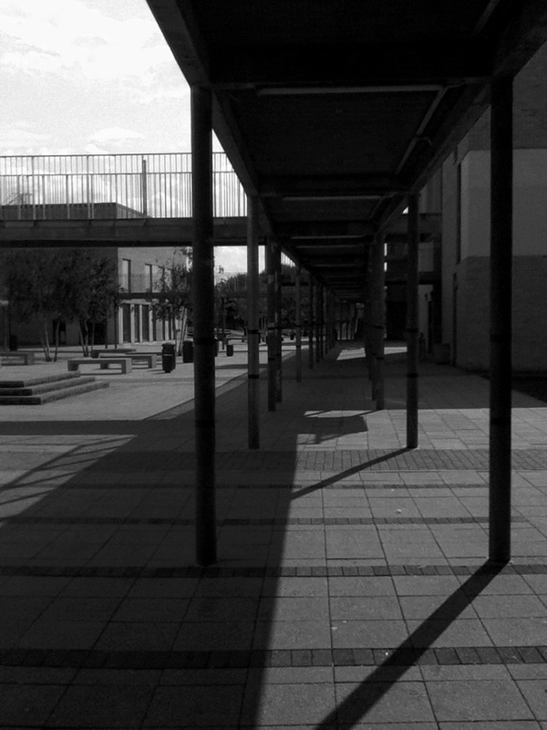
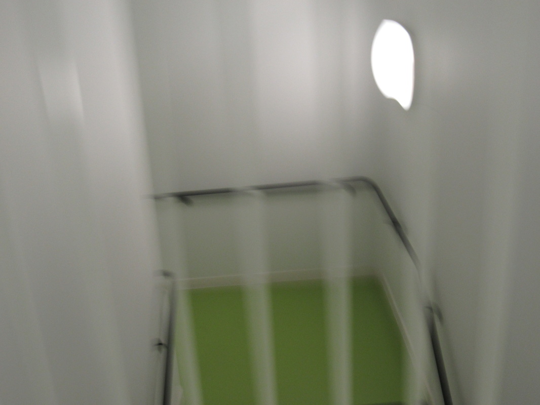
Final Outcome
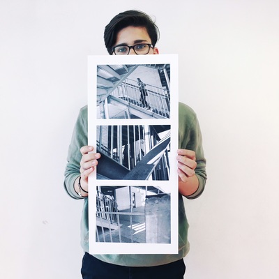
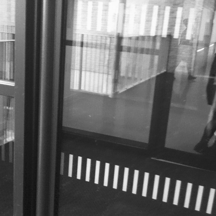
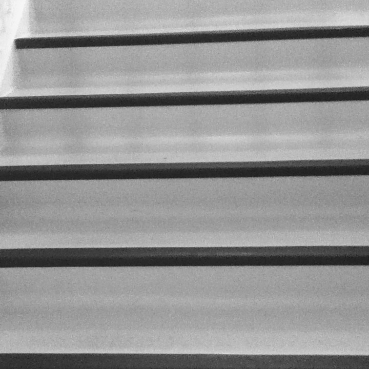
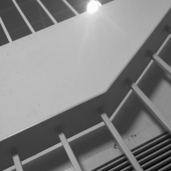
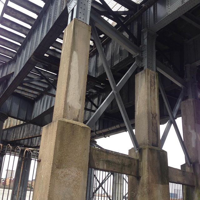
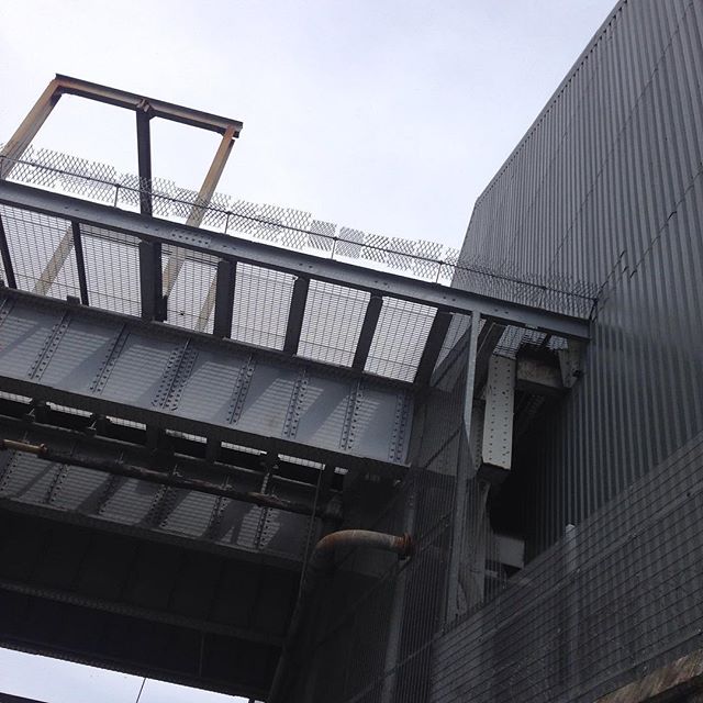
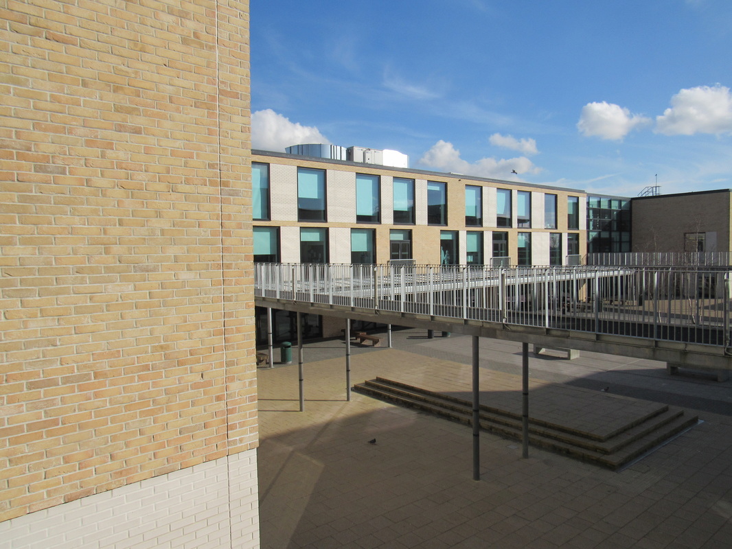
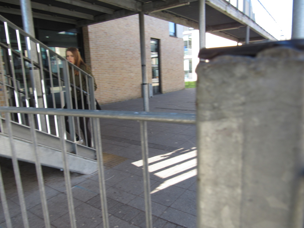
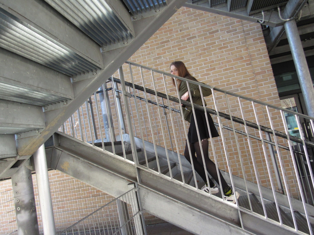
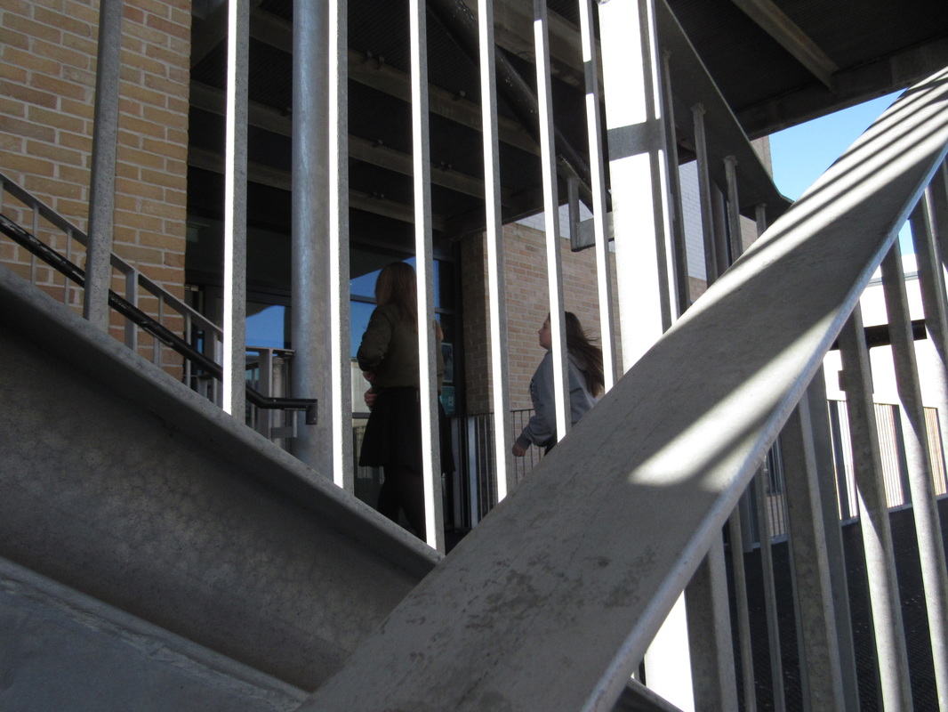
This is my final outcome, i took these photos by allowing Alanah to walk up the stairs, whilst I took pictures from different angles. Then as she walked up the stairs i followed,capturing key moments in the sequence. All in all i took around 10 images and shrunk the selection down to three. Then i transfered them into photoshop and and changed the colours to black and white, but i played with the contrast, adjusting them to my liking. I chose this pictures because i fell that they are interesting to look at because of the metal rods and beams on the walkways. They create the illusion that the photographs are sectioned off, like those of Saul Leiter, as well as adding dimension.
